
Thursday, March 31, 2011
Normal Mapping
Here is my current low poly mesh with the high poly detail normal mapped down. I haven't finished painting the texture yet so this texture is just 50% grey with the ambient occlusion pass on top to help the normal map pop out. Overall I am pleased with the look. the low poly mesh is a mere 2500 tri's (I limited myself to a quarter of a next gen character poly limit as its roughly a quarter of the character) and it is really showing a lot of the high poly details. There is one glaring problem area in the low poly and thats the mechanical chest piece, the valves in the centre are appearing nice and smooth which is impressive as they are just four quads. But the rest of the chest piece isnt working incredibly well. I am going to keep playing around with it to get the best results. The other problem area is actually an issue I think with the high poly mesh and that is the head plates which as I have mentioned in previous posts I dont have the tools yet in my copy of zbrush to get really clean edges. But I can forgive this in this mesh as its the back of the character and wont be scene much I will be fixing it as soon as I can. Everything else I am really impressed by how much of the detail comes across in the low res mesh.

Monday, March 28, 2011
Low Poly Bust
I've just finished modelling the low poly version of my bust, it still needs uv mapping and a bit of tweaking on topology. I could do with removing some of the polygon density in the mask as its quite high compared to the rest of the model. The next step is uv mapping the bust and then spending some time playing around with the normal maps generated from my high poly whilst I finish up the texturing. The reason I want to spend some time playing with the normal maps is to work out the best way of making the low poly mesh to capture as much of the high poly detail as possible. Obviously you dont want to spend time making the lovely detail if you cant see any of it on the low poly. But all in all I am very pleased with how this little side project has been going, I haven't had as much time this year to do litte projects outside of uni to improve, although luckily the uni work has been more in the areas that I enjoy and wanted to improve on. However I would have liked to have spent more of this year practising my zbrush work. The aim of this quick little project was to put together all the little bits I have learnt that I had in my head of how my workflow was going to be and finish an entire model in that workflow to cement it. Doing the project has emphasised this is definately how I like working, the ease in which I can work in zbrush feels far more artistic than the very technical maya and allows you to really brings ideas to a model much quicker.


PolyPainting
In keeping with the theme of the last few blog posts I will be posting the progress I am making on my character bust. I am happy with the look of the piece for what the project was designed to be, I now have a good idea for the full character and over the next couple of weeks will start working on that. Anyway I am digressing from the point of this post, seeing as I am happy with the sculpt (at least all the major forms of it anyway) I decided it was time to start texturing. I have been texturing in a different way to the way I normally do, instead of unwrapping the uvs of the character and opening them up in photoshop I have simply used polypaint to painting straight onto the polygons of the character. This is good for several reasons; first of all a 2k texture has roughly 4 million pixels in the document, although quite a lot is taken up by black space. My model when subdivided has something like 27 million polygons all of which can store colour information, second because I am painting in 3D I dont need to worry about texture seems, and can the model as it appears in 3D, I can go back into sculpting mode whenever I won't if I want to add or subtract surface detail. Finally I I am not missing out on any of photoshops fantastic features as I can just position the model and open it as a projection in photoshop, make changes and drop them back onto the zbrush canvas. Another advantage is not having to uv map the character before paiting. Instead I will paint on the polygons then when I have finished my low res block and uv mapped that, I will bake the normal, ambient occlusion and the colour information from the hi res down onto the uv's of the low res. So all in conclusion all characters with normal maps will be painted in zbrush, as it is so quick and easy to do. I've only really been working on the skin (an area I need to improve on) this morning, everything else has just been given block colours as place holder detail and will be dealt with next.


Friday, March 25, 2011
Turntable
I've posted a couple of still from this mini project over the last couple of nights when I've been working on it. I'm very pleased with how its been going along my aim for the next couple of weeks and from then is to make zbrush the main program being used in my workflow, especially for character work. The aim when I started this project was just to get practise in and hopefully make something portfolio worthy. I decided to start with just a character bust as I wasn't working from any concept art and I wanted this to not be a long drawn out process as I still have uni work to balance with. So really the aim was to concept as I sculpted and create a snapshot of the full character using my full next gen workflow. So I would start with high poly sculpt in zbrush, polypaint and ZappLink for texturing, then construct game res mesh in maya and create maps for the low res. This turntable movie represents a pretty close to finished high poly sculpt. I like the overall simplicity of the piece and the combination of hard surface mask, battered flesh and tubing. When I was adding the tubes I didn't want to over do it visually, hence why I started to using some zsphere tubing as a place holder and sculpted the skin over it to do the impression of tubing just underneath the skin. In terms of short comings and things I need to improve on I think the main thing is just spending the time to improve the organic sculpting and sculpting things like scar tissue. I'm currently using version 3.1 of zbrush so I'm missing a lot of features added in 3.5 and 4, particular things like the hard surface brushed that would really help with the mask. But a good workman doesn't blame his tools, I think the result is good here just could be slightly more polished if I had a few of the features I am looking forward to using. The back of the flesh has had less time spent on it than the front, mainly because the mesh has a rather striking look from the front and 3/4th and seeing as I'm making it game res I like to think about the characters context withing a game. The obvious conclusion I game to was he isn't like to be the protagonist and thus you are likely to only be seeing him from the front and trying to unload a couple of magazines of ammo into him before he rips your head off. So front needs the detail and the back not as much, although this hasn't stopped me making visually interesting detail such as the spine tube, its just meant I've spent a bit less time on the skin on the back. Apologies for the length of the post, I was going to go into the background ideas that have come to me while sculpting this character but I'm waffling as it is so I'll save it for next time.
Untitled from Toby Rutter on Vimeo.
Thursday, March 24, 2011


Tuesday, March 22, 2011
Bust-a-Move
With my business deadline today and out of the way I decided, let the weeks of intense zbrush practise commence. To start of I decided I would do a bust of character using my new next gen character workflow. I started with a quick zsphere mock up, before making an adaptive skin and starting to sculpt. I'm coming up with the concept as I'm going and I like how its looking at the moment. I may take the time now to do some quick sketches on top of these images in photoshop to plan out a few ideas. I may also open the mesh up in maya to sculpt extra subtools around the mesh before importing and appending then in zbrush to detail them. Once I have my finished hi poly bust, I am going to paint the texture using a combination of polypaint and photoshop. Then I will open a mid level obj into maya (I reckon I can do up to about 134k faces as I'm not moving it) then I will sculpt the low res mesh around it. Then I will bake the normals, ambient occlusion, diffuse and a cavity map using xnormal.


Monday, March 21, 2011
Evaluation
Time to get all evaluation-y on my latest finished project. It's been long enough since finishing it that I can actually evaluate it as opposed to just hating it which is my usual response to a finished piece of work .
When I set out I decided as a sort of side objective/goal that I wanted to create something very stylized to really fit with the theme of the brief. I feel this has been achieved.
Secondary Objective was to be a bit more realistic and less over ambitious. This I think I managed to fail.
As with many of my projects I feel my idea was fairly ambitious because of the timescale I had to complete it in. Due to wanting to complete the animation for the deadline I don't think I spent enough time thinking of different ideas. Instead I had a good one and ran with it.
I did change my workflow in the planning stage to, I feel, better fit the brief. As it was very character centered I decided I would come up with what the character would be like, personality etc, before I started coming up with any visual ideas. This I hoped would make sure that the visuals really represented the characters personality, making it easy for the audience to understand the character.
I also did a lot of research into good practises and things to ask yourself about the character you're creating which I felt really helped the character creation process. I also did a lot of deconstruction of relevant animations/characters that influenced the creation of my own so I could understand what I enjoyed about these characters and hopefully use it to improve my own designs.
After a talk from Bob the Builder creator Curtis Jobling, I decided ,as it filled the time requirement of the brief, to create the intro/title sequence as my animation. As if it was the intro to it as a real tv series. I discovered in my research that in kids tv shows it is usual for the intro to include all the backstory so that anyone can sit down and watch an episode and completely understand what is happening. However although with good intention the scope of my idea would have been better suited to the first 12-20 minute episode rather than the 30-60 intro.
I feel most of the projects shortcoming develop from this problem. Due to time that would be required to model, rig , texture, animate and render all the characters and sets in my idea I chose to use a combination of 3D and 2D cutouts (much like stage props) to create the animation. This way only some of the scenes and one of the character were modelled, textured etc in 3D. The theory was that this would help keep to the brief by focusing more on one character, my protagonist Isaac. This style was something new for me to experiment with, but in the end I cant help but feel that everything would have looked better if it had all been made in 3D. Due to time running out I didnt manage to get my voice over for the animation which would really help to make sure people can understand what is happening. Also there is much to my annoyance one scene that I couldnt finish the occlusion pass for, meaning it doesnt look as good as it should.
Anyway rant over, I'm sure I can think of more but that will do for now
Finished Animation
Here is the finished animation for my Business Module. I already have the attitude towards it that I have with all my work, if I did it again there is so very much I would change/have learned/would be better. I have written up an evaluation of the piece and like with the other research I've done on the project will probably type it up quickly and post it, as it is much more readable than my handwriting.
Untitled from Toby Rutter on Vimeo.
Sunday, March 20, 2011
More Research
I bit of research into a cartoon I really like and how my ideas have benefitted from it, but also how my idea differs in comparison
Fairly Odd Parents
Fairly Odd Parents is an American Animated TV show from the mind of Butch Hartman IV.
It follows the life of a school boy named Timmy Turner and two fairy godparents who grant Timmy wishes. Like my character Isaac, Timmy is bullied and miserable. He is bullied by his next door neighbour and baby sitter the 16 year old Vicky , but also his school teachers and the school bully. Timmy escapes his problems or solves them using the wishes he is granted to send him on magical adventures.
There are some similarities in the style of Fairly Odd Parents and my idea. For one both Timmy and Isaac and lonely and struggle with being bullied in their normal day. But both develop friendships with out of this world characters. In Timmy’s case his fairy godparents and for Isaac his superhero friend. However where I think there is a difference between Timmy, who has been an influence in Isaac’s creation, is how they act. Timmy is quite immature in the use of his wishes every episode and often things end up going horribly wrong and he has to resolve the situations, which is how he learns his lessons. Isaac has no super powers and is just an ordinary boy and in not wishing for anything he wants is more mature than Timmy, but in a similar way will learn lessons from the various adventures he goes on with his superhero which he can then apply to the ordinary everyday situations he faces at school to help him get through his everyday troubles.
The another different between the two ideas is that Timmy’s world is very exaggerated and magical, I want my character to be facing more real world problems that the audience can empathise with and will potentially help them learn something about how to deal with issues, such as bullying. This isn’t to say that the adventures with the superhero won’t be slightly out of this world but I think its important to balance this with Isaac’s everyday life.
Character Design Research
The next couple of blog posts and going to be type ups of a lot of research I have done over the course of this module. Some is general character creation tips, that I researched, others and some evaluations of characters that I deconstructed to help me come up with my own.
Credit where credit is due these character creation tips by Jon Burgermen are really good.
Creating Animated Character Tips
Research and Evaluate
Deconstruct why certain characters and their characteristics work and why some don’t, think what makes them successful and why you like them.
Design and Plan
Where will the character be seen (what medium?) for example on a mobile screen would require less detail than a character for film.
Who is it aimed at?
Think about audience. Break down core features eg; personality then focus your design around these key features.
Visual Impact
Everything has been done before, how do you make yours original. Something visually striking such as the Simpsons yellow skin could set your idea apart.
Line Quality and Style
Thick/ soft / round lines make characters seem approachable or cute
Sharp/ scratchy/ uneven lines make for uneasy or erratic characters
Exaggerated Characteristics
Helps the viewer recognise the characters key qualities.
Colour
Colours communicate personality
Blacks/purples/greys are colours traditionally used for “bad” characters
Whites/blues/pinks/yellows are colours traditionally used for “good” characters as they are associated with innocence and purity
Reds/Yellows/Blues are heroic bold colours traditionally associated with characters such as comic superheroes
Adding Accessories
Props emphasis character traits and backgrounds
Scruffy clothes can represent a poor background
Diamonds/bling could emphasise a spoilt/rich character
3D
Even if the character is 2D think about the character in 3 dimensions, visualise from all angles
Conveying Personality
How do the characters react in situations is the best way to demonstrate their personality
Express Yourself
Character Expressions also a key demonstrators of their personality.
Goals and Dreams
What drives the character, why do they get up in the morning?
Building Back Stories
How did the character some to be
Quick on the Draw
Experiment, ignore the rules when just spit balling ideas. If you know the rules you can break them for good effect.
Hone, Plan and Polish
Keep iterating, the best designs come of iteration, constantly look at the design or idea and be cruel does something serve its purpose. Be willing to remove something even if you like the idea but it doesn’t quite fit the character.
Drawn in the Mud
Good characters should be able to be conveyed with as little lines as possible. Experiment drawing the character with less and less lines, or in primitive mediums.
Real life Drawing
Think about the environment the character lives in and what this reflects about the character.
Release the Beast
Show people your work, and get feedback. More importantly see if they can guess the characters personality without knowing anything about it.
Beyond the Character
Think about the other character you character interacts with and the world they live in.
Fine Tune
Iterate again and again.
Thursday, March 17, 2011
Animation Test
He is a test I did when I was finished with most of Isaacs walk cycle but before I had spent some time tweaking it. The finished result looks alright, but if theres one this that this has driven home it's that I'm not as much of an animator as I am other things. I know how to animate, but when it comes down to it I would much rather spend hours tweaking and working in subtleties on a character model than an animation. In this project I also discovered the I'm enjoying rigging more and more. So if given a choice in order of preference my within the CG pipeline is Modelling, Texturing, Rigging.
Untitled from Toby Rutter on Vimeo.
Assets
Heres a render of the dumpster from my business of animation project. At the start of the project we were told we should pick an objective or personal goal to try and achieve through the project. Mine was to practise and create a stylized piece of CG animation. I found creating nice looking stylized 3D work quite difficult, and people who are good at it really impress me, so this I felt was a good challendge. I feel that my 3D environments and assets for this project have really achieved what I set out to do. But I think my stylized character modelling isnt as strong yet as it normally is. I found that the idea I jumped on was like much of my work pretty ambitious especially for the length of time I was given in the brief. As a result I decided to trying and create a kind of cut out animation for all the characters apart from Isaac which the animation was following. The reasons being to make completely the project achievable within the time frame and as the brief wanted the focus to be on one character to keep it there by distinguishing with different styles the main and background characters. This has been a good problem solver for this project but I dont really think the style works brilliantly, the overall look would be much better if there were complete cg sets, all the characters were modelled in 3D and if my stylized character modelling was better.


A Little Research
I've been doing some research for my Business of Animation module, as this is part of our learning objectives to research working practises and conventions of the area we are working in for our brief. Whilst coming up with character concepts I come across a news article that I mentioned in a previous blog post, the article was comparing more modern super hero creations to the older more "traditional" ones such as superman, spiderman etc. I decided that I would post the article, particularly as I am running out of space in my sketchbook and am trying to save paper but really because I thought it was interesting and had an interesting bearing on my super hero design thoughts.
This article was taking from the Telegraph's website.
The debate about violence in the media has reared its head again, with an American psychologist, Dr Sharon Lamb, claiming that modern-day superheroes such as Iron Man are far worse role models than their 20th-century predecessors.
"Today's superhero is too much like an action hero who participates in non-stop violence. He's aggressive, sarcastic and rarely speaks to the virtue of doing good for humanity," she says. "When not in superhero costume, these men, like Iron Man, exploit women, flaunt bling and convey their manhood with high-powered guns." She pines for the "comic book superhero of yesterday", whom boys could look up to because "they were real people with real problems and many vulnerabilities".
Does media violence encourage the real thing? And are modern superheroes any worse than their ancestors? The first question is difficult to answer, and really one for behavioural scientists, not journalists. A 2008 meta-analysis on the subject in the journal Criminal Justice and Behavior, which looked at the results of several earlier studies, found no link, but the findings were uncertain and further studies have said otherwise. It is open for debate.
But Dr Lamb seems to be wrong even on her own terms. For a start, Iron Man is hardly "today's superhero". Certainly, the film only came out in 2008, but Stan Lee developed the character in 1963. Besides, the "bling" lifestyle of Iron Man's alter ego, Tony Stark, a billionaire arms manufacturer, is not so different from that of Batman's Bruce Wayne, created in 1939. You can see why they do it: if your superhero has no actual superpowers, but relies instead on expensive equipment and training, it makes sense to write it so he's rich enough actually to afford them. It's a plot device.
In fact, most of the superheroes Dr Lamb decries are simply movie versions of old comic books. There's plenty to disapprove of – it's derivative, boring and shamelessly trawling for box office receipts – but her fundamental point is flawed. Recent superhero movies have included X-Men (based on characters first created in 1963); Watchmen (1986); Batman Begins (1939); The Incredible Hulk (1962); Fantastic Four (1961); Spider-Man (1962) and Superman Returns (1938). If Dr Lamb really wanted to criticise modern superheroes, she could point out that they don't exist: nobody seems to have thought up a really interesting new one in 25 years. And things don't look like changing – 2011 will see the return of the Green Lantern and the Green Hornet, two more staples of the 1940s. Dr Lamb will at least be pleased to see the former, whom she holds up as a positive role model for having a dull day job.
I thought this was really interesting how superheroes that were originally designed to be exciting real character, with weaknesses and flaws, but ultimately designed to also be positive role models, have supposedly shifted in recent years. It's my belief that the advent of superhero films are largely responsible for this articles claim that they've all become more about violence than being a positive role model. As the article points out towards the end there havent been any new interesting superheroes in the last 25 years, so the characters that are supposedly no longer good role models are the same characters as when they were first created, what has changed? Lots of hollywood films jumping on the superhero bandwagon with many of the films not being a)very good (cough fantastic four) or b)not very true to the original character/story. Over the last year we've seen films made for green hornet, this year thor, and green lantern hitting the big screen, with films for an x-men prequel, third film in the current batman series, and the new spiderman film. This suggests that superhero films wont be going anywhere soon.
I am not suggesting that my very stereotypical superhero side character is new and interesting, but this was a thought that occured to be when designing him. Do I need to be really original? No in fact as a side character I chose to adhere very much to your stereotypical comic character as I did with many of my side characters simple so that audiences of my target age range would know the characters regardless of whether they were regular viewers or not.
Wednesday, March 16, 2011
More Render Tests
I've been at it again playing around with render tests, this time most of the settings have been kept the same, the difference being I have been testing out the background I was planning on using for the animation to give it the feel that it was taking place in a school exercise book. The exterior scenes work very well with the colour pass set to darken, however interior shots that have more ambient occlusion get a bit dark. Using a dark colour layer setting helps a bit, and in this scene adjusting the brightness by about 30 brough the scene back up to the normal, without letting the lines show through the coloured portion of the scene. At the moment I am just experimenting as there are plenty of different options available to me. As I am rendering passes out as targas I have access to built in alpha channels and could do something like an opacity mask on the occlusion layer, but I would have to make sure I only knocked down the opacity in the mask so it was effecting the background rather than the actual objects as other wise it would start to ruin the nice effect my occlusion pass is giving the renders.


I've been at it again playing around with render tests, this time most of the settings have been kept the same, the difference being I have been testing out the background I was planning on using for the animation to give it the feel that it was taking place in a school exercise book. The exterior scenes work very well with the colour pass set to darken, however interior shots that have more ambient occlusion get a bit dark. Using a dark colour layer setting helps a bit, and in this scene adjusting the brightness by about 30 brough the scene back up to the normal, without letting the lines show through the coloured portion of the scene.


I've been at it again playing around with render tests, this time most of the settings have been kept the same, the difference being I have been testing out the background I was planning on using for the animation to give it the feel that it was taking place in a school exercise book. The exterior scenes work very well with the colour pass set to darken, however interior shots that have more ambient occlusion get a bit dark. Using a dark colour layer setting helps a bit, and in this scene adjusting the brightness by about 30 brough the scene back up to the normal, without letting the lines show through the coloured portion of the scene.
Render Test
Its nearly that fun time again, its been nearly a year since I've actually had to sit down and render out an animation (I'm normally all about the realtime rendering because it's well realtime). With the business module coming to a close I am just wrapping bits up finishing and tweaking bits and bobs. There have been some big gaps in the posting of this work so over the next couple of days I'll have a big catch up and post everything I've been working on. This is a little render test I have done to get an idea for the feel of the 3D elements of the animation. This project has been a really interesting learning curve for me as I have tried to get better at creating simple stylised work withing maya, but also the use of 2D and 3D in the program. I've also been taking a bit of time to learn some more about rendering techniques despite it not being something I normally use in my work. This render is very simple, I used maya software for rendering out the diffuse layer and mental to render an occlusion pass. I normally bake out occlusion passes into texture for my game character work, but that would have required me to uv map a large number of assets that were only going to receive very basic texturing. And because it wasnt completely necessary unlike working for games I decided to save time in the modelling and texturing stage and add a bit at render time. This has been composited together in photoshop, although I may end up using aftereffects for composite to together finshed clips, depending on how much freedom I get to play around it AE. So the workflow is looking to be; render out passes in Maya, compile images for diffuse, and occlusion in separate movie clips in Adobe Premiere, then open clips in After Effects to composite them together. I had also originally planned to composite over a background so the animation looks like its happening in a school exercise book, I am currently looking at my different alpha channels to see how possible this will be.

Monday, March 14, 2011

Sunday, March 13, 2011


Saturday, March 12, 2011


Friday, March 11, 2011


Thursday, March 10, 2011


Monday, March 7, 2011
Isaac Model
This is a screenshot of the nearly completed Isaac model, the only thing left to finish is the head, in the image I've replaced the work in progress head with a simple place holder I was using for scale. I'm currently umming and arrringg between different ways of making the face look right for the character as it's such an important part. Other than that everthing is finished and I have begun to rig the character, by the end of the week max I want everthing bar all the animation done giving me another week and a bit to just sort a few things out. This character model got somewhat pushed to the side (as has a lot of things) due to my game project which has been rather all encompassing, and while it's very unlike me to push a character modelling opportunity aside Isaac's 3D model wasn't intreging me as much as some of the game detail stuff which I could really sink my teeth into.


Some More Cutouts
Here are some more the 2D images I have drawn, then digital painted and then made (or are being made) into 3D cutouts. Here we have the bullies, the villains of Isaac's day to day life and the pram which Isaac saves from being run over by a bus, this act of heroism is misinterpreted as being the work of the Green Templar and helps him see that he should stop moping around and start helping people again (cue awesome adventures avec Isaac). I really looked at the brief when thinking about the character of Isaac. I wanted to make a premise for an animation that kids could relate to, and something that stuck out to me was that during my age bracket is the transition from primary to secondary school and all the changes it brought with it. On top of that you have the transition to adolescance which people encounter all kinds of issues and I thought I would be cool to try and challenge issues such as being an outsider and dealing with bullies in the animation (if it was made as a tv series). The other thing that interested me was an article I read describing the change in super heroes of the current day. The article talked about how nowadays super heroes are more like violent action heroes than the defenders of ideals and ordinary people they were when they were invented. I wanted to bring this back a bit with the design of the characters. Particularly because the values that traditional superheroes upheld and good lessons to teach children.


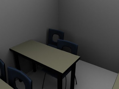
Classroom Scene
This is the second interior environment, which will be used for three seperate but quick shots. With one just being pretty much as still of the character sat at his desk by himself. Again I used a similar style of modelling with the classroom as the superhero hideout, I wanted everything to look like it belonged to the same world.


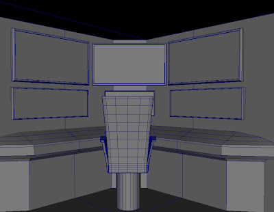
Superhero Hideout
Same old story, blog posts have been a bit thin and far inbetween recently, but it's getting dead close to assessments for all my modules so hopefully this will force me back into regular posting.
Anyway the current looming deadline (after life drawing which is friday, although currently I dont post any life drawing work here, perhaps thats something I should get around to) is the Business of Animation Module. I've found balancing the modules this term a bit tricky and I hope that everthing works out the way I planned in the end. Anyway digressing. This post is a little bit of an update on the superhero hideout. I am rather pleased with this simple environment piece, one of the two interior pieces in my animation. When I started out I started with just a few simple but hopefully visually striking features that would embody the room. As the action in the animation is going to be fast paced with lots of quick transitions I wanted the viewer to be able to read the room/scene quickly. On top of this the simple style of the animation meant that I didn't want any one shot to be too noisey with detail. I am currently just messing around with simple shaders for the texturing of different environments. I had originally planned to uv map and texture everything by hand. But this struck me as a rather large task which was quite pointless when I wasn't going to be painting any complicated textures and the viewer just needs to know what everything is. Again trying not to bog them down with details. So the plan is simple; simple shaders on everything and an ambient occlusion render pass to help high light some of the awesome simple detail in scenes like this one. Ambient occlusion helps to bed anything so it's well worth doing. Especially on high poly to low poly game geo which is normally the ball park I work in.
Anyway the current looming deadline (after life drawing which is friday, although currently I dont post any life drawing work here, perhaps thats something I should get around to) is the Business of Animation Module. I've found balancing the modules this term a bit tricky and I hope that everthing works out the way I planned in the end. Anyway digressing. This post is a little bit of an update on the superhero hideout. I am rather pleased with this simple environment piece, one of the two interior pieces in my animation. When I started out I started with just a few simple but hopefully visually striking features that would embody the room. As the action in the animation is going to be fast paced with lots of quick transitions I wanted the viewer to be able to read the room/scene quickly. On top of this the simple style of the animation meant that I didn't want any one shot to be too noisey with detail. I am currently just messing around with simple shaders for the texturing of different environments. I had originally planned to uv map and texture everything by hand. But this struck me as a rather large task which was quite pointless when I wasn't going to be painting any complicated textures and the viewer just needs to know what everything is. Again trying not to bog them down with details. So the plan is simple; simple shaders on everything and an ambient occlusion render pass to help high light some of the awesome simple detail in scenes like this one. Ambient occlusion helps to bed anything so it's well worth doing. Especially on high poly to low poly game geo which is normally the ball park I work in.


Subscribe to:
Posts (Atom)