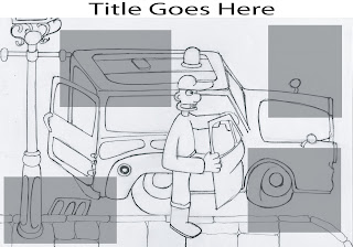
This is the draft of the layout for my critical analysis piece, I am writing a short history of Aardman animation with a bit of a focus on the work of Nick Park. On Tuesday I went to see the Wallace and Gromit exhibition at the Herbert Art Gallery/Museum in Coventry, here they had on display a number of sets and pieces from Wallace and Gromit's Curse of the Were-Rabbit. The sets were amazingly detailed and I made some sketches of them as I walked around, I picked one of my better sketches to be the background image for this piece. It was simply Wallace getting out of the Anti-Pesto Van. I chose it because unlike most of the other sketches I got nearly the complete scene on the page, whereas I couldnt do justice to some of the others because of the raw level of detail in some of the sets.
On the piece I have begun to draft in where blocks of text/ images will be along with where my title will go as I have yet to decide on an exact wording of the title. I like the opaque boxes as it enables the audience to still view the image and it doesnt break it up too much, so i think i will keep it like that when i start to add the information, although i may alter colours. The whole piece is sized as an A3 piece of paper which may not be clear from this image.
No comments:
Post a Comment