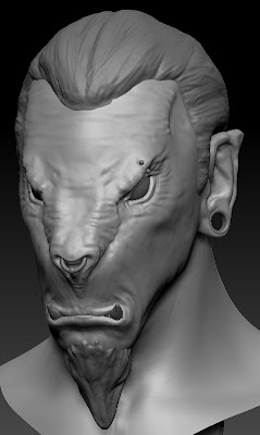
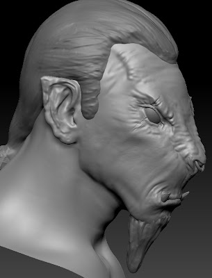
Sticking to changing big shapes/details first I set about changing the piercings on the model to something a bit more final than the placeholders I had put in before. I liked the idea of the ring through the nose, but have three of the same piercings wasn't as varied or visually interesting as it could be. So I made they eyebrow piercing a bit more subtle and added a stretcher to his right ear. I really like this simple addition for several reasons. Firstly it makes him look less like a pirate. Secondly it forces the shape of the entire right ear to change breaking the symmetry of the face. Finally like the negative space it gives the characters silhouette, making the silhouette more interesting.
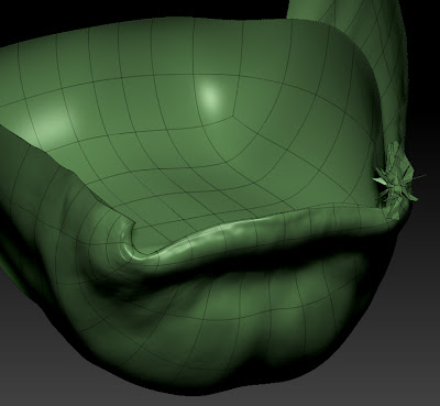
I did however have to do some slightly menial tasks during the process of cutting a hole in the characters ear. I cut the new geometry at the lowest subdiv level and then re-projected all my lovely hard work back onto the new base. However this often needs a bit of clean up afterwards. As you can see in the screenshot of the corner of the mouth ZBrush didn't know which part of the mouth it should be projecting to so I had to go back in with morph and smooth brushes to fix these little bits.
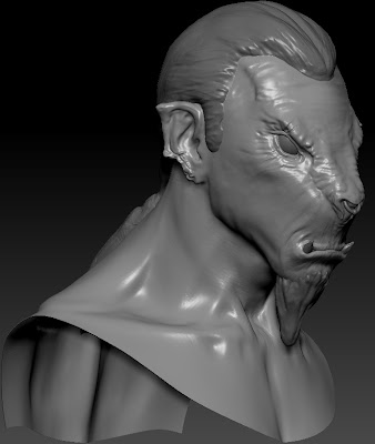
The next step was to introduce some scarring to the left ear, this was another suggestion put forward by one of my fellow students. I liked the idea creating the some details that looked as if part of his ear had been bitten. I thought this sat well with the character as I wanted to give him a few war wounds but not making him look ridiculously battle warn. Bitting someones ear seems like the kind of wound you might get if you were fighting as a child which I felt fitted. The next area I worked into was defining the shoulder region that is going to be in the final shots, It's a fairly simple region if your not on steroids and most of the muscles are shown through suggestion. After I had laid these shapes down the whole model looked a lot better, as previously this area had been very smooth and plastic-y. That said the entire model still had a relatively plastic-y surface to it. Fixing this was the next port of call.
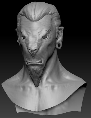
I break up the surface and stop it being perfectly smooth I used alpha brushes at the highest subdiv level at quite low z intensities so they didn't create protruding details. Then I would drop down a level and smooth them out. Overall this helped to give the model an uneven surface that wasn't chucking up long specular highlights. It gave the model the 3D equivalent of teeth on a canvas.
No comments:
Post a Comment