Wednesday, November 30, 2011
The wonder that is Polypaint
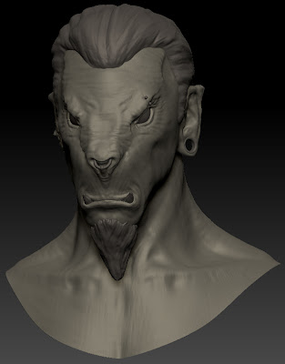
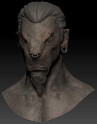
First step is to apply a base colour to the model. I'm going for a light grey brown colour for this character, as I have a nice reference of a mountain goat and I rather like the light fur/skin that would blend in well in snowy mountains.
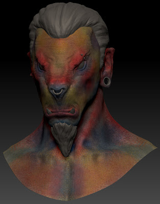
The next step is pretty garish, I apply on a separate layer bright reds for areas of high blood flow, blues for cool areas, purples for recesses, and yellows to add variance to large areas of skin. This will be largely covered up by later layers but gives the skin realistic variation in the texture without are sub surface scatting materials applied.
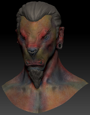
I then used an alpha brush on a new layer which desaturates the alpha and breaks up the shapes giving a more skin like feel and reduce the intensity of the skin variance layer.
The next layer I start with low opacity brushes to bring back some of the base colour over the top of these layers bringing it back closer to the skin colour I want.
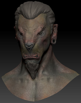
This next layer is a continuation on from the last one, I am starting to model some of the texture adding slight highlights and lowlights to emphasise features. This is by no means a finished texture. From here I will continue to refine the skin colour, returning to previous layers where I need to. I will also use textures and photos to paint details directly onto the model. Once I've finished the bust I shall then move onto the hair and accessories.
Beastman Modelling Continued
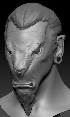
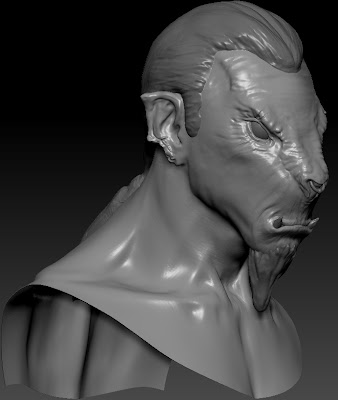
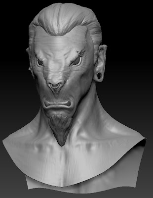
Sticking to changing big shapes/details first I set about changing the piercings on the model to something a bit more final than the placeholders I had put in before. I liked the idea of the ring through the nose, but have three of the same piercings wasn't as varied or visually interesting as it could be. So I made they eyebrow piercing a bit more subtle and added a stretcher to his right ear. I really like this simple addition for several reasons. Firstly it makes him look less like a pirate. Secondly it forces the shape of the entire right ear to change breaking the symmetry of the face. Finally like the negative space it gives the characters silhouette, making the silhouette more interesting.
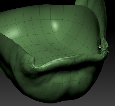
I did however have to do some slightly menial tasks during the process of cutting a hole in the characters ear. I cut the new geometry at the lowest subdiv level and then re-projected all my lovely hard work back onto the new base. However this often needs a bit of clean up afterwards. As you can see in the screenshot of the corner of the mouth ZBrush didn't know which part of the mouth it should be projecting to so I had to go back in with morph and smooth brushes to fix these little bits.
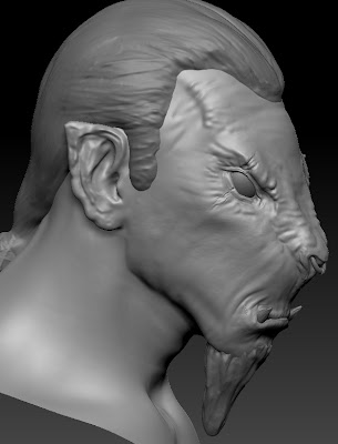
The next step was to introduce some scarring to the left ear, this was another suggestion put forward by one of my fellow students. I liked the idea creating the some details that looked as if part of his ear had been bitten. I thought this sat well with the character as I wanted to give him a few war wounds but not making him look ridiculously battle warn. Bitting someones ear seems like the kind of wound you might get if you were fighting as a child which I felt fitted. The next area I worked into was defining the shoulder region that is going to be in the final shots, It's a fairly simple region if your not on steroids and most of the muscles are shown through suggestion. After I had laid these shapes down the whole model looked a lot better, as previously this area had been very smooth and plastic-y. That said the entire model still had a relatively plastic-y surface to it. Fixing this was the next port of call.
I break up the surface and stop it being perfectly smooth I used alpha brushes at the highest subdiv level at quite low z intensities so they didn't create protruding details. Then I would drop down a level and smooth them out. Overall this helped to give the model an uneven surface that wasn't chucking up long specular highlights. It gave the model the 3D equivalent of teeth on a canvas.
Tuesday, November 29, 2011
Female Head Model
I started quite typically with an established head base mesh, the one from my previous male head sculpt, I then used some 3d.sk reference shoot photos as reference for my to push and pull verts until it pretty much matched the reference. The problem with using reference images as a guide is even good reference shots don't line up and whilst you can use photoshop to scale and rotate the images so that the major landmarks match up you are still dealing with perspective distortion etc. So I like to follow the images as much as possible then get the model over into zbrush sharpish where I can very easily use the move brush to tweak forms.
This image above was how the head as looking leaving Maya, it looks rather strange, which is the result of problems with reference images and also working on half the model then mirroring. When you only work on one visible half it often doesn't look right when its mirrored. I set about correcting some of the shapes until I got to the image below, which is a massive improvement although theres still a lot left to get right in secondary forms before I begin to detail. I posed the mouth more neutrally, and need to construct the inside of the mouth before I begin fixing the lips. The eyes need a lot of work but they are at least placed correctly in the head which is almost half the battle.
This image is of the head a bit further along the process, I have altered some of the profile shape of the nose and sculpted the ear to match the reference which is helping a lot, I've also softened the line of the jaw which is making the sculpt read as more feminine. When drawing the female form it's important to use lots of soft lines and only draw lines/shadows based on the light source thus limiting the lines on the face. These things are much harder to do in 3D. I still need to get the balance of detail right to make sure she doesn't look plastic and smooth but at the same time excessive detailing can very quickly age a character.
Nariko Character Evaluation
Heavenly Sword is an action-adventure/hack and slash game created by developer Ninja Theory, publishing by Sony Computer Entertainment Europe. It was one of the launch titles for Sony's Play Station 3.
Heavenly Sword has a very interesting story revolving around concepts such as prophecy, tyranny, sacrifice with an underlying stance on futility of human conflict. The story begins with a brutal warlord known as the Raven King who controlled the land by destroying all who opposed him. Answering the prayers of those he subjugated a warrior descended from heaven and defeated the Raven Lord, after the battle the warrior disappeared, but his weapon remained. From then on men greedy for power fought over the sword, and over time it became fuelled by their blood lust, the sword began to absorb the life of whoever wielded it. Eventually a clan of warriors intervened in the cycle of death and destruction surrounding the sword and took it upon themselves to protect the sword from those who sought its power, waiting for the day when it was prophesised that the heavenly warrior would return and lead them to the promised land.
Nariko is even at the games outset an incredibly tragic figure, her only friend in the world is a troubled and disturbed young orphan named Kai, who Nariko treats as a sister. Her relationship with her father is an uncomfortable one to say the least, he views her as a constant disappointment as she was not the hero prophesised. Shen (Nariko's father) takes a role more of a tutor that her father, attempting to separate himself from her emotional, but continues to teach her and raise her as a warrior. He is filled with many conflicting emotions over Nariko, hatred for failing to fulfil the prophecy and for taking her mother from him, and also guilt that he tried to take the life of his newborn daughter, and an uncertainty as to whether he made the right decision not to. From the beginning of the game the characters are complex in their own right, but better still they actually relate to each other making the whole story feel much more real.
Visually the game draws a look from eastern culture, and I believe that Shen and Nariko's relationship also draws a lot from the feeling of disappointed that parents in ancient
Nariko definitely falls into the archetype of the hero. Despite all she has been through with her father and her clan, she still opts to make the ultimate sacrifice and offer her life to the heavenly sword in order to free them from and defeat King Bohan. Nariko is driven by a rage fitting with her fiery nature. She wants nothing more than to destroy King Bohan and free her clan. Despite this rage all the way through the story she is still incredibly selfless one of the key character traits of the hero. She even shows mercy on King Bohan when she has defeated him and the Raven King has left his body, leaving him crippled. Rather than let her rage get a hold of her and finish him, she lets him live at the request of his son Roach.
I think one of the key things that helps Nariko to work as a wonderfully complex and tragic heroine, is the way her face is animated, Heavenly Sword was one of the first games to use facial motion capture, even having Andy Serkis working as the Dramatic Director and voicing/acting a character himself. In this way so much of Nariko's character is taken and then pushed even further by the performance of Anna Torv, and using motion capture software allows the facial animators to really build of the subtlety of performance and the way Anna Torv delivered her lines.
Monday, November 28, 2011
Evaluating Character Design
Visually Raziel is very distinctive, he appears very skeletal as much of his humanoid vampire form was burnt away leaving muscle and bone exposed. He is missing his lower jaw which he covers by wearing the banner of his former clan as a cowl. He skin is blue which has lots of meaning attached to it as every colour does. In the context of the story his blue skin is based on Hindu mythology in which blue skinned characters are known for depth of character and the capacity to fight evil. Raziel still retains the tattered remnants of his wings which Kain tore from his body,
The story of the Legacy of Kain games revolves around destiny, fate and the characters trying to avoid their predetermined paths in life. Raziel is trapped in a highly cyclical destiny, he is himself a paradox that time needs to resolve and how it is resolved will have massive consequences for the world of Nosgoth. He is ultimately a tragic character who fell from grace and believed capable of redeeming himself. However he comes to realise that also he is creature of free will his destiny is predetermined and although his free can change the destiny of all the other characters of the story he can only postpone his own, rather than avoid it entirely. He is driven by a fear of his ultimate destiny which is to become the hungering spirit that dwells inside the soul reaver.
Beastman Modelling
I moved on to blocking out the hair volume that had looked quite promising on paper, and even at an unrefined stage this was working with the overall sculpt and once I have worked into it a bit more I'm sure it will look even better.
Finally I used an existing male base mesh to attach the head to, this would allow me a bit more shoulder for my bust, and also then make the model ready for when I want to create a full body version of the character. I spent quite a long time retopologising the neck area, as this hadn't been done particularly well when I did my original base mesh, and I also fixed a few areas around the eyes improve the general edge flow of the model for the better.
Achieving Professional Quality Work
I have approached gaining the knowledge necessary for professional quality work in three main ways. Firstly I have bought books such as D'Artiste Character Modelling, which showcases the very best character modellers in the games industry and includes interviews and discussions talking about their processes and workflows. I have also bough DVDs from established industry artists which have the advantage of being able to show you them actually working on projects (admittedly sped up). This lets you gain really valuable into their working methods. I've looked at DVDs of comic and concept artists such as David Finch and Peter Han to gain insight in how they approach drawing the human figure particularly the head, as this is directly relates to my current learning objectives. From Peter Han's DVD I came to understand the benefits of using models and professional photoshoots to gather really high quality reference, which I don't have the funds to do myself but I have signed up to use 3d.sk which provides thousands of reference shots from these exact situations.
The next way I have gained professional experience is by getting work experience working as a character artist at Undrawn Reality a games company making AAA quality games, through working there I have learnt about the pipeline for the creation of next gen game characters, became familiar with it and applied it to me own work. This has proven invaluable as working in a professional environment. on real projects, and working to deadlines is the best way to push the quality of your work and achieve really professional quality.
The final way in which I have gained a greater understanding of how to achieve professional quality in my work is through networking. I've been networking for the last two years as a way of gain industry contacts and finding about how to best get a job in the games industry. Every time I meet 3D artists or artists in general working in the games industry I always ask and take an interest in they way they approach the work as a way of researching and improving my own.
Just some of the reference images from one 3d.sk photoshoot.
Beastman Design Continued
Beastman Concept
Thursday, November 17, 2011
Beastman Head Work in Progress
Starting Beastman Modelling
Once I had separated these two pieces I left the helmet alone completely and just focused on the beastmans head. Just refining this rough concept. By adding things like the line of the mouth and the idea for a more pronounced lower jaw with a pair of larger teeth exposed.
When I arrived upon a shape that I liked for the overall head I decided it was time to retopologise. Whilst dynamesh is fantastic for being able to concept away it doesn't make the most efficient use of polygons, due to not have a readable topology. This means that eventually you will want to get more definition for the polygons your using (unless you have a computer than can handle more subdivisions but I'm restricted to about 6 max 7 depending on the original base mesh size). So I set about retopologising and separating out items such as the beard, and began modelling the interior of the mouth.
Thursday, November 3, 2011
Creating Realistic Characters: Applying the Uncanny Valley to character design
Mori's Hypothesis displayed visually as a graph, charting human likeness against positive and negative familiarity.
In terms of visuals, what the uncanny valley means to artists is that as they pursue photo or complete realism the fall prone to having their creations fall short of the goal of being as familiar and as clear in human likeness as a real person, and end up in the uncanny valley. The likeness of their creation can be very near to a human, but to an audience it still evokes that sense of uneasiness, that something isn't quite right with what they are looking at.
As people we have built in an ability to sense when something isn't right when looking at an imitation of a human, this is down to the fact that we spend the vast proportion of our time, looking at and interacting with other humans, we hold eye contact when we communicate forcing us subconsciously to take in lots of details about a person's face and their body language. All of this has means we are very good at spotting when something isn't as we feel it should be, even if we don't know specifically what it is. As a result of this even artistic creations that come far up the right hand side of the uncanny valley can still be viewed with uneasiness and fail to bring audiences to empathise with them.
However within the field of animation it has become apparent that visuals only make up part of what the audience uses to determine whether or not they will empathise with what is on the screen. The way in which a character moves, communicates and is animated makes a huge difference to how the audience receives it. The character of Gollum played by Andy Serkis in the Lord of the Rings Trilogy holds a very definitive bar in the level in which a digital character can be brought to life. By using motion capture techniques Weta Workshop where able to fully capture Andy Serkis' acting that really brought the character to life. However the film the Polar Express used identical motion capture techniques in an effort to enhance their characters which had been designed to be as realistic as possible. The difference is quite incredible as an audience member you wouldn't expect to find yourself finding a malnourished halfling more familar and closer in human likeness than a child. But the fact of it was that the Polar Express's characters, whilst being incredibly realistic in appearance, lacked something necessary for audiences to register them as human.
In the current generation of gaming a number of developers have started to use the same motion capture techniques used in films such as Lord of the Rings, developers Ninja Theory even working with Andy Serkis as their dramatic director. It is evident from the games these developers have produced, that their have managed to strike the balance between realistic characters and avoiding the uncanny valley. Where film it is still common for film visuals to chase the idea of computer generated humans that are indistinguishable from actors, for example the CGI representation of a young Jeff Bridges in Tron Legacy, games have, due to the constraints of working in real time, settled for a more stylized take on. Naughty Dog's Uncharted series is a prime example of how an entire cast of game characters can be ordinary humans rather than steroid using super soldiers and still engage players.
The conclusions I have drawn from researching the uncanny valley are as follows. When creating realistic characters it is important to remember "realism" isn't confined visuals, the character's performance, animation and how the audience responds to it are all equally important. With this in mind it is worth considering how much character Pixar's Luxo lamp has and its just a lamp. Within the medium of games it is always better to pursue stylized realism as it gives your game an identifiable style and allows you to in most case avoid the uncanny valley as you aren't trying to capture quite as much of the nuances of what makes up a human being.
Above is an incredibly detailed 3D still life of Scarlett Johansson by Ahmad Ramadan, however once compared to a photo it becomes very obvious that it is an imitation.
My conclusion is that chasing photo realism in CGI at this time is rather a futile, films have tried to seamlessly blend computer generator films with live action actors and not one has managed it yet. The original designs for the Navi in James Cameron's Avatar where originally much more human in likeness but early on they realised that because of the uncanny valley it would be impossible for the two to sit convincingly on the same screen. This led to features being exaggerated making the Navi more like humanoid animals, keeping enough human characteristics that they audience could relate to them without going to far and failing to engage the audience.