Wednesday, December 7, 2011

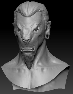
Beastman Renders

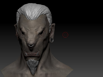
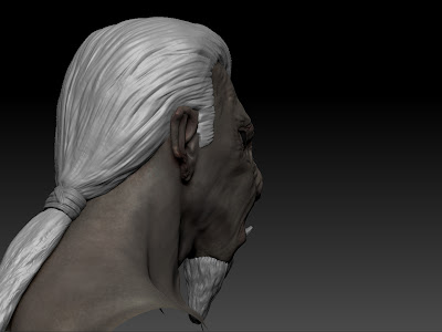
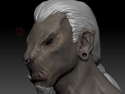
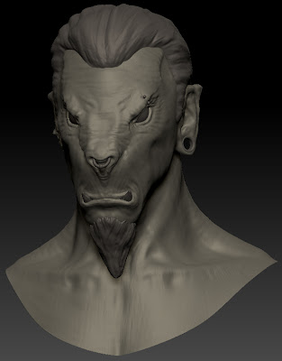
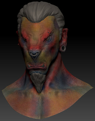
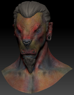
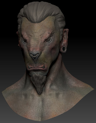
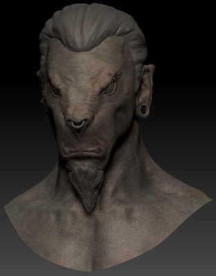
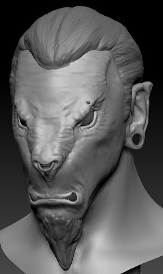
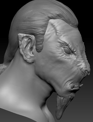
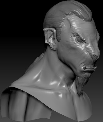
Here are some smaller resolution versions of my final renders, these renders were rendered out of zbrush and are the basic composites from photoshop, I have some much higher resolution composites that are the finished versions, but they are a bit big to upload. I'm a bit to close to this piece of work to do very deep evaluations right now. Overall I am pleased with it, the creature model itself is definitely pushing my modelling skills to a higher level which is always good. The texturing pipeline was a new one that I hadn't worked with before but was very rewarding and gets fantastic results for skin. I am now a lot more familiar with zbrush layers, and the spotlight photo texturing feature. The main areas I am unhappy with in this sculpt are the modelling and texturing of the hair, and the texturing of the eyes. Solid geometry is never going to look as good as alpha planed hair, and when I create the game resolution version of this character I will create alpha hair, and I'm sure I will be able to achieve some really nice results in engine. So whilst I'm unhappy about the hair in this model I don't think it detracts too much and at least I know where to go from here and how to improve that for the next model. The texturing of the eyes was another area I think let the model down, I wasn't able to get the right balance of a nice shiny specular with hints of environment/HDRI style reflections in the eyes to really give that realistic feel. I also should have spent more time designing the eyes, and looking at different animal reference for ideas. That's a broad evaluation of the model, when I've managed to let everything settle I will perform a more in depth post mortem no doubt.


Tuesday, December 6, 2011

Hair Test

Hair has been causing me numerous problems recently. I knew modelling the hair that I wasn't going to be able to adopt the approach of using lots of alpha mapped planes which is the standard approach for creating in game hair. This was due to rendering constraints within zbrush. So I opted to create essentially place holder hair in the form of solid geometry. This has already taken two separate sculpts to get it looking as it does presently and its still a long way from being good. But as solid place holder geo it all right. My main issue with it is when it comes to the texturing. I've tried texturing with poly paint and using high res hair textures and spot light. Neither of these methods have yielded anything I've really wanted to use. In this screenshot I've just painted strands quickly into lightened areas in photoshop and done some colour correction to the darker colour I wanted the hair to be. This is looking like the most appealing solution right now as it's giving passable results. There would be options I could use if I was rendering out of maya or max but it would require me setting up identical cameras and generally faffing around a lot.

Expression Tests

I've been starting to pose the model create some expressions. This has been going well and I'm really feeling like this project is finally coming to a close. The hair still needs to be textured up, maybe you can tell that I'm procrastinating from that a lil bit. I'm quite pleased with a lot of these shots, although they will need to be worked into a bit more. I'm finding it quite hard to adapt the research I've done into human facial expressions into this model. Which isn't unexpected due to his very different facial structure. His face shape lends itself, as with his character, to more aggressive expressions. And due to his more prominent lower jaw, the corners of the mouth don't move up well. Animals seem to convey more with the language of their body as a whole, whereas people are cable of conveying emotion with very slight facial indicators. Where I to go back and redo this project knowing I would be adapting quite an animalistic character as my final piece I would have done more research into animal faces, for instance how dogs look when they are happy, sad, etc. The centre image is the face at the default position I sculpted it, which I feel is quite a neutral pose for the character. The fourth from the left is by far my favourite, the shouting pose works so well with the character. The closest to the right is the least aggressive and although its subtle I think really works, I think the position of the head makes him look proud. An the lowering of the corners of the mouth demonstrates that it looks more natural when the corners of this mouth move down rather than up due to the construction of his jaw/teeth. The closest to the left is the best happy expression so far, I'm attempting to create a snarly/smirk using one corner of the mouth. I think this is on the right track but needs to be more exaggerated in order to read well. Originally I was thinking of doing six renders but there is a nice symmetry to five. Also a lot of the major human expressions I conveyed through how you can see the eyes. In my experiments so far the animal eyes I've give are not expressing in the same way, and to him give pupils is going to be quite strange due to the position of the eye, I think he might look constantly cross eyed.

Test Render

Recurring theme, yet another test render, this is much closer to the kind of result I want on the final renders. The shadows are a bit intense for my liking and that will be an area to tweak. The hair also has a large specular component which is something I want to remove in zbrush. However if I can't get a good look for the hair I can always make adjustments in the composition in photoshop. It's always going to be hard to get wax shaders to create good looking hair, my aim for the hair is just to make sure it's not detracting or pulling too much attention away from the rest of the image. I have a very faint sss component on this render and its helping to add a lot of life to the skin. On the final renders I'm going to improve areas like the high reflectivity on the piercings by creating masks per subtool allowing me to isolate areas such as the eyes or hair etc and tweak them individually.

Monday, December 5, 2011

Test Render

This is my second test render, which shows a massive improvement since the first test render. This is down to a few setting tweaks, and some experimenting with how I composite the layers together in photoshop. The model itself is nearing completion, slowly but surely, the hair still needs to be re-textured, but the inside of the mouth is all done now. I've started to pose a scream/howl expression for the character, partly to get the ball rolling on posing him and partly out of necessity to paint the interior of the mouth. So bearing in mind there are some tweaks to the pose I will be doing I don't think this is looking to bad. The render is missing some specular passes that I will do one the final ones as well as a subsurface scatter pass to really bring together the skin texture. I'm also going to use environment reflections to compliment the spec with the eyes. In the final render I want to tone down some of the harshness in the shadows as I can always build them up through layering in photoshop. Overall there's still a big list of things to do, I would still like to get some form of tattoo or war paint on the model, to add some more interest to the shoulders. I'm also going to pose him with the head slightly turned to make all the poses feel more dynamic.


Sunday, December 4, 2011

Jawsome

So moving on to texturing the interior of the mouth. I've spent a lot time over the last day messing around with hair which is still looking fairly static and lego-y. With the deadline fast approaching I've decided to let it be for the moment and it will likely be coming up in the evaluation of things to do better next time. So onwards to the only area that hasn't received any texturing attention yet... the interior of the mouth. This the lower jaw, the upper is just a duplicate of this. I've been trying to strike a balance between spending too long creating beautifully textured gums and just bucket filling them. They probably aren't going to get seen a lot, as I'm probably only going to do one or two open mouth expressions. Even in these expressions a lot of this is probably going to be lost by shadows. Next on my list is to texture the tongue before I go back and texture the upper jaw, it's never fun texturing duplicates so I like to break it up by doing other things. I may also tweak the base colour on the gums to a slightly different colour scheme I haven't decided yet. Once the interior of the mouth is finished I'm going to go through and apply final touches to the skin and eyes.

Friday, December 2, 2011

Sculpting Hair

This has literally had me pulling my hair out. oh dear that's a bad pun and it's probably not going to get much better than that. But more on hair in a second. Today we had the last lecture/tutorial before the assessment for this module. I used the opportunity to demo the progress I had made on this model to the guys and gals at uni and was lucky to get a lot of positive feedback, which is always good for feeding the ego. When I showed the character to the class our lecturer had the class brainstorm the character/personality of this model. This was really good as the vast majority of things people were picking up on are aspects of the character I had designed, with one or two things I will be adding as they were good suggestions. This is really pleasing as it means my art is portraying its character well and is easy enough to read.

There were only a few feedback points that came out of the section, it was suggested the teeth were a bit too symmetrical still, so I've taken a moment to alter the shape of one and chip the end of the other, simple stuff but it helps to break up the symmetry in the face. The major area that definitely needs work is the hair, hence this post. I was having a really hard time polypainting the hair and the feedback today highlighted that more work just needs to be done.

The first thing I did was clone my original hair subtool, I didnt want to lose any of the previous work. I've then just smoothed everything else and started again basically and already I'm much happier with it. I'm going to keep sculpting into the hair and then use zpsheres to create some messy strands that will move aways from the head, particularly down the back, although I'm unlikely to be taking a lot of renders from the back I don't want one area of the sculpt to feel neglected. Once I've sculpted the hair to a level I'm satisfied with I'm going to re-topologise the mesh, as I've done with all the meshes I've made using dynamesh. Having an even topology makes a big difference when it comes to using polypaint. It is also quite likely that I will need to uv the hair and beard and use photoshop to get a really good result in the texturing. Polypaint works fantastically for skin but I've got a lot of options with texturing overlays in photoshop.

Thursday, December 1, 2011

Test Render

This image is a test render composite using ZBrush's BPR rendered, it renders the images and lets you save out its separate passes and composite them in photoshop. This is a really simple test, I will be doing several more passes on the final renders to get specular highlights and some sub surface scattering. But overall I like the result, it will look a lot better when I have created a customised lighting setup. As you can probably see the texture painting isn't yet finished but I'm making progress, I've started to block in values on the hair and teeth, as well as progress to even out the final skin tone. I want to strike a happy balance between getting a varied skin tone but not having the texture look like it was painted by Seurat. As pointilism is all well and good but it would like to be able to get some close up renders without showing off how dotty the texture is.

Wednesday, November 30, 2011

The wonder that is Polypaint

Ah polypaint, this post is actually going to be a post about the texturing pipeline I am using to texture my beastman bust, but seeing as I'm using polypaint a large amount in the process there will be a fair bit of waffle about how/why it's good. I'll start briefly with a "what is polypaint/why is it good?" Polypaint is a feature in ZBrush (and I also believe you can do similar things in Mudbox but don't quote me on that) which allows you to apply colours directly to polygons. Thus texturing you object. Now the advantage of ZBrush is that providing your computer can manage it can cope with millions of polygons per subtool (and many subtools) and up to a billion polygons with HD sculpting. That's a lot of polygons you say, well you are correct and its a lot of potential for storing colour information. If you were to unwrap a model a texture it in photoshop and 2K texture has 4,194,304 pixels of colour information, but unwraps are never 100% efficient leaving a sizeable chunk of that unused. This means that if you have a model with more than 4 million polys you are getting more colour information by painting straight onto the model. Polypaint also has the benefit of being applied directly to the surface of the model making it much more intuitive a process. Now my favourite bonus of using Polypaint is that because the information is stored in the polygons if you move them the information is still there. If you unwrap a character and need to make changes you often going to need to re-unwrap and in some cases do some serious re-texturing work. I hate being at the stage in modelling when you are pretty sure you don't want to do any more to the model but not 100%. Like in the case of this model. I know I want to get the texturing started but I may want to make tweaks when they occur to me and I don't have the luxury of time right now. Anyway onto the model.

First step is to apply a base colour to the model. I'm going for a light grey brown colour for this character, as I have a nice reference of a mountain goat and I rather like the light fur/skin that would blend in well in snowy mountains.

The next step is pretty garish, I apply on a separate layer bright reds for areas of high blood flow, blues for cool areas, purples for recesses, and yellows to add variance to large areas of skin. This will be largely covered up by later layers but gives the skin realistic variation in the texture without are sub surface scatting materials applied.

I then used an alpha brush on a new layer which desaturates the alpha and breaks up the shapes giving a more skin like feel and reduce the intensity of the skin variance layer.


The next layer I start with low opacity brushes to bring back some of the base colour over the top of these layers bringing it back closer to the skin colour I want.


This next layer is a continuation on from the last one, I am starting to model some of the texture adding slight highlights and lowlights to emphasise features. This is by no means a finished texture. From here I will continue to refine the skin colour, returning to previous layers where I need to. I will also use textures and photos to paint details directly onto the model. Once I've finished the bust I shall then move onto the hair and accessories.

Beastman Modelling Continued

The last day or so has been that very awkward stage of modelling, there is lots of little changes and tweaks to be made that overall will improve the model, but they can often be hard to see. The trick is trying to get fresh eyes on your work where ever possible. The easiest way to describe what I've been working on in these images is breaking symmetry. Symmetry is a wonderful time saver but there comes a point where you have to say no more. This is difficult to do because the brain is programmed to tell us that symmetry is good, the idea of a perfect face is one that is symmetrical, however nothing looks more faked/cgi/not really than something perfectly symmetrical.

Sticking to changing big shapes/details first I set about changing the piercings on the model to something a bit more final than the placeholders I had put in before. I liked the idea of the ring through the nose, but have three of the same piercings wasn't as varied or visually interesting as it could be. So I made they eyebrow piercing a bit more subtle and added a stretcher to his right ear. I really like this simple addition for several reasons. Firstly it makes him look less like a pirate. Secondly it forces the shape of the entire right ear to change breaking the symmetry of the face. Finally like the negative space it gives the characters silhouette, making the silhouette more interesting.

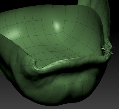
I did however have to do some slightly menial tasks during the process of cutting a hole in the characters ear. I cut the new geometry at the lowest subdiv level and then re-projected all my lovely hard work back onto the new base. However this often needs a bit of clean up afterwards. As you can see in the screenshot of the corner of the mouth ZBrush didn't know which part of the mouth it should be projecting to so I had to go back in with morph and smooth brushes to fix these little bits.


The next step was to introduce some scarring to the left ear, this was another suggestion put forward by one of my fellow students. I liked the idea creating the some details that looked as if part of his ear had been bitten. I thought this sat well with the character as I wanted to give him a few war wounds but not making him look ridiculously battle warn. Bitting someones ear seems like the kind of wound you might get if you were fighting as a child which I felt fitted. The next area I worked into was defining the shoulder region that is going to be in the final shots, It's a fairly simple region if your not on steroids and most of the muscles are shown through suggestion. After I had laid these shapes down the whole model looked a lot better, as previously this area had been very smooth and plastic-y. That said the entire model still had a relatively plastic-y surface to it. Fixing this was the next port of call.

I break up the surface and stop it being perfectly smooth I used alpha brushes at the highest subdiv level at quite low z intensities so they didn't create protruding details. Then I would drop down a level and smooth them out. Overall this helped to give the model an uneven surface that wasn't chucking up long specular highlights. It gave the model the 3D equivalent of teeth on a canvas.

Tuesday, November 29, 2011

Female Head Model

I've decided to start posting up the work in progress shots from a female head model I made a little while back and analyse/evaluate the model. My brief for this female head was to create a highly detailed model based on some reference photos. She also would have to be bald/have a shaven head, which sounds easy, just don't model hair. But it can be quite tricky to make sure the shapes of the head that are normally obscured look right.
I started quite typically with an established head base mesh, the one from my previous male head sculpt, I then used some 3d.sk reference shoot photos as reference for my to push and pull verts until it pretty much matched the reference. The problem with using reference images as a guide is even good reference shots don't line up and whilst you can use photoshop to scale and rotate the images so that the major landmarks match up you are still dealing with perspective distortion etc. So I like to follow the images as much as possible then get the model over into zbrush sharpish where I can very easily use the move brush to tweak forms.
This image above was how the head as looking leaving Maya, it looks rather strange, which is the result of problems with reference images and also working on half the model then mirroring. When you only work on one visible half it often doesn't look right when its mirrored. I set about correcting some of the shapes until I got to the image below, which is a massive improvement although theres still a lot left to get right in secondary forms before I begin to detail. I posed the mouth more neutrally, and need to construct the inside of the mouth before I begin fixing the lips. The eyes need a lot of work but they are at least placed correctly in the head which is almost half the battle.

This image is of the head a bit further along the process, I have altered some of the profile shape of the nose and sculpted the ear to match the reference which is helping a lot, I've also softened the line of the jaw which is making the sculpt read as more feminine. When drawing the female form it's important to use lots of soft lines and only draw lines/shadows based on the light source thus limiting the lines on the face. These things are much harder to do in 3D. I still need to get the balance of detail right to make sure she doesn't look plastic and smooth but at the same time excessive detailing can very quickly age a character.

Nariko Character Evaluation

Heavenly Sword is an action-adventure/hack and slash game created by developer Ninja Theory, publishing by Sony Computer Entertainment Europe. It was one of the launch titles for Sony's Play Station 3.

Heavenly Sword has a very interesting story revolving around concepts such as prophecy, tyranny, sacrifice with an underlying stance on futility of human conflict. The story begins with a brutal warlord known as the Raven King who controlled the land by destroying all who opposed him. Answering the prayers of those he subjugated a warrior descended from heaven and defeated the Raven Lord, after the battle the warrior disappeared, but his weapon remained. From then on men greedy for power fought over the sword, and over time it became fuelled by their blood lust, the sword began to absorb the life of whoever wielded it. Eventually a clan of warriors intervened in the cycle of death and destruction surrounding the sword and took it upon themselves to protect the sword from those who sought its power, waiting for the day when it was prophesised that the heavenly warrior would return and lead them to the promised land. On the night that the clan prophesied the rebirth of the heavenly warrior, Nariko was born claiming her mothers life in childbirth, her birth becoming a dark omen nullifying the prophecy leaving the clan in despair. Her father the clans leader even tried to kill her, but out of guilt could not go through with it. So Nariko grew up an outcast upon her own dwindling people, who constantly saw her as the cause of their misfortune.

Nariko is even at the games outset an incredibly tragic figure, her only friend in the world is a troubled and disturbed young orphan named Kai, who Nariko treats as a sister. Her relationship with her father is an uncomfortable one to say the least, he views her as a constant disappointment as she was not the hero prophesised. Shen (Nariko's father) takes a role more of a tutor that her father, attempting to separate himself from her emotional, but continues to teach her and raise her as a warrior. He is filled with many conflicting emotions over Nariko, hatred for failing to fulfil the prophecy and for taking her mother from him, and also guilt that he tried to take the life of his newborn daughter, and an uncertainty as to whether he made the right decision not to. From the beginning of the game the characters are complex in their own right, but better still they actually relate to each other making the whole story feel much more real.

Visually the game draws a look from eastern culture, and I believe that Shen and Nariko's relationship also draws a lot from the feeling of disappointed that parents in ancient China had upon receiving a daughter rather than a son. Visually Nariko is clearly set apart from the rest of the clan by her bright red hair, a feature clearly inherited from her mother, the colour of her hair is clearly symbolic of her fiery personality born of a life of lonely segregation and hardship. It also functions as a visual metaphor of how her clansmen see her as being from hell rather than heaven.

Nariko definitely falls into the archetype of the hero. Despite all she has been through with her father and her clan, she still opts to make the ultimate sacrifice and offer her life to the heavenly sword in order to free them from and defeat King Bohan. Nariko is driven by a rage fitting with her fiery nature. She wants nothing more than to destroy King Bohan and free her clan. Despite this rage all the way through the story she is still incredibly selfless one of the key character traits of the hero. She even shows mercy on King Bohan when she has defeated him and the Raven King has left his body, leaving him crippled. Rather than let her rage get a hold of her and finish him, she lets him live at the request of his son Roach.

I think one of the key things that helps Nariko to work as a wonderfully complex and tragic heroine, is the way her face is animated, Heavenly Sword was one of the first games to use facial motion capture, even having Andy Serkis working as the Dramatic Director and voicing/acting a character himself. In this way so much of Nariko's character is taken and then pushed even further by the performance of Anna Torv, and using motion capture software allows the facial animators to really build of the subtlety of performance and the way Anna Torv delivered her lines.

Monday, November 28, 2011

Evaluating Character Design

I am going to spend some time de-constructing the character of Raziel from the game series Legacy of Kain, and potentially also give the character of Kain the same treatment as the two characters are central to the interesting story of the games and their interactions are as interesting as their individual characters.
When Raziel is first introduced to the audience he is a Vampire Lieutenant (not the sparkly kind) of the self proclaimed Vampire God Kain. It is later revealed that Raziel was raised to be Kain's Lieutenant from the body of a Sarafan Warrior Priest. The Sarafan being an order that hunted and killed nearly all the vampires in Nosgoth. Raziel is the first of six lieutenants of Kain and has served him for over a millennium, at the beginning of the game he is revealed to have entered the state of change and evolved a new vampiric gift before his master. Seemingly for this transgression he is executed by being thrown into the lake of the dead. Raziel was burned alive for hundreds of years before his torment receded and he is brought back by a creature known as the Elder God. He is transformed in a wraith who inhabits the spectral realm. The Elder God gives Raziel the means to travel back to the physical realm, where he can maintain his form by absorbing souls of the living, so that he can get his revenge on his master and brothers for destroying him.

Visually Raziel is very distinctive, he appears very skeletal as much of his humanoid vampire form was burnt away leaving muscle and bone exposed. He is missing his lower jaw which he covers by wearing the banner of his former clan as a cowl. He skin is blue which has lots of meaning attached to it as every colour does. In the context of the story his blue skin is based on Hindu mythology in which blue skinned characters are known for depth of character and the capacity to fight evil. Raziel still retains the tattered remnants of his wings which Kain tore from his body,
Raziel sees himself as a fallen angel, risen again to exact his revenge as the reaver of souls. He is very self righteous and it is his greatest flaw. It's negative qualities light this that really helps give the character depth rather than being two dimensional. Early on in the story Raziel is very much driven by his emotions. Initially he is totally motivated by rage and lust for revenge. He comes to understand that he was not destroyed out of petty jealousy as he had believed, and that it had all been part of some grand scheme of Kain's, in which he was another pawn. Raziel is very reluctant to being used by Kain, although he ultimately finds himself used time and time again by the various characters of the story. This is due to the fact that following his destruction he was reborn as a creature of free will and able to change his destiny and with it the fate of Nosgoth. Raziels hatred for Kain never ceases but he starts to be more motivated by the want to shake of the shackles of fate and be able to exert his free will.
The story of the Legacy of Kain games revolves around destiny, fate and the characters trying to avoid their predetermined paths in life. Raziel is trapped in a highly cyclical destiny, he is himself a paradox that time needs to resolve and how it is resolved will have massive consequences for the world of Nosgoth. He is ultimately a tragic character who fell from grace and believed capable of redeeming himself. However he comes to realise that also he is creature of free will his destiny is predetermined and although his free can change the destiny of all the other characters of the story he can only postpone his own, rather than avoid it entirely. He is driven by a fear of his ultimate destiny which is to become the hungering spirit that dwells inside the soul reaver.
Although Raziel is the games protagonist he falls most into the shadow Jungian Archetype, which normally contains villains. He is essentially an evil murderous character but he has morals and ethics like all characters. This is what makes him such interesting in my mind. Added to this his tragic story the player can see how Raziel is driven to the things he does and despite him being an evil character we never feel like we as a player don't want to be him.

Beastman Modelling

After concepting various different directions I could take the model I experimented with a few in 3D. The mohawk whilst the concept looked good on paper (even though it didn't make a lot of logical sense I was still reluctant to dismiss it outright) didn't work as well in 3D, the large amount of bald head draw a lot of focus away from the rest of the character. So without detailing or spending two long on the model I realised I was going to have to bin the idea.

I moved on to blocking out the hair volume that had looked quite promising on paper, and even at an unrefined stage this was working with the overall sculpt and once I have worked into it a bit more I'm sure it will look even better.


Finally I used an existing male base mesh to attach the head to, this would allow me a bit more shoulder for my bust, and also then make the model ready for when I want to create a full body version of the character. I spent quite a long time retopologising the neck area, as this hadn't been done particularly well when I did my original base mesh, and I also fixed a few areas around the eyes improve the general edge flow of the model for the better.

Achieving Professional Quality Work

The major underlying object of specialist study as I see it is to complete all the other learning objects to a professional standard. These modules are after all designed to make sure we are ready to enter our chosen industry at the end of the year. The first and possibly hardest obstacle in achieving professional quality work when you are outside of the industry is knowing the workflows and practises that the incredibly talented artists working on AAA games use. Once you know you using the right methods you still have the task of building your skills until you are on par with these artists, but constant practising is easier than trying to work out how to be as good as an artist such as Kevin Lanning, from Epic Games, when you don't know what tools he uses as his medium.


I have approached gaining the knowledge necessary for professional quality work in three main ways. Firstly I have bought books such as D'Artiste Character Modelling, which showcases the very best character modellers in the games industry and includes interviews and discussions talking about their processes and workflows. I have also bough DVDs from established industry artists which have the advantage of being able to show you them actually working on projects (admittedly sped up). This lets you gain really valuable into their working methods. I've looked at DVDs of comic and concept artists such as David Finch and Peter Han to gain insight in how they approach drawing the human figure particularly the head, as this is directly relates to my current learning objectives. From Peter Han's DVD I came to understand the benefits of using models and professional photoshoots to gather really high quality reference, which I don't have the funds to do myself but I have signed up to use 3d.sk which provides thousands of reference shots from these exact situations.


The next way I have gained professional experience is by getting work experience working as a character artist at Undrawn Reality a games company making AAA quality games, through working there I have learnt about the pipeline for the creation of next gen game characters, became familiar with it and applied it to me own work. This has proven invaluable as working in a professional environment. on real projects, and working to deadlines is the best way to push the quality of your work and achieve really professional quality.

The final way in which I have gained a greater understanding of how to achieve professional quality in my work is through networking. I've been networking for the last two years as a way of gain industry contacts and finding about how to best get a job in the games industry. Every time I meet 3D artists or artists in general working in the games industry I always ask and take an interest in they way they approach the work as a way of researching and improving my own.


Just some of the reference images from one 3d.sk photoshoot.
Around the time that I had decided horns weren't going to be part of the character, I had a lot of suggestions saying "he looks great you should give him horns". By this point I had decided that the character was a sword for hire after he left his tribe in the mountains and journeyed down in the (slightly) more civilised world below. So I wondered if some form of horned helm, in the style of barbarians or vikings would suit the character. This attempt makes him look like a fantasy american football player and wasn't to my liking. I saw him for as a kind of lithe agile ranger mercenary. Someone at home in the wild due to his nomadic upbringing a the bestial influences on his way of life. Helmets and heavy armour in general I thought conflicted with that.

The next design idea I entertained for a bit but ultimately decided that I wasn't so sure about was horns. Based on the kind of bestial look I wanted in the character and the kinds of animal skulls etc that I was looking at for reference, horns were an idea from rather early on. I used some previous sketches and drew quick horns on to see how I felt about them. None of the horn drawings are particularly refined which was due to the fact that as I drew them I really wasn't feeling them as being part of the character. In the same way that I didn't think the larger boar teeth had worked I felt that horns give a creature as majestic look. A stag or bull with large horns in a more physically impressive and dominant character and that certainly didn't strike me as being in character or in the character of the tribe. On a personal level this character felt like Hellboy in some respects when I was thinking about horns, in the sense that if in the tribe have large horns was a sign of importance this character would have broken his off to rebel against that. I decided the race were more utilitarian in their evolution, they had no need for displays of dominance through unwieldy horns.


I was continuing to experiment with hairstyles in this concept and decided to try out a common punk staple the mohawk and shave of the rest of his hair. I do rather like the hair cut but I'm a little bit vary of making an art decision purely for the sake of how it looks visually. For anyone who's tried to get their hair into one of these you'll know that you need so fairly gravity defying hair products or glue (and even glue doesn't work amazingly well). Even if hair products were invented in the civilised towns and cities of this fantasy world, they would be the kind of things noblemen might use, and would not be the kind of thing warrior tribes living in harsh mountains would. So as a result I decided despite it looking cool that this wasn't the right direction for the character. I also very quickly sketched some longer boar style teeth in to see how they compare.


This was a really quick digital sketch, the only thing I really changed was the orientation of the head and then I duplicated it, the wonders of working digitally, and quickly sketched some positions of piercings on the face. From the offset I decided I wanted to use an odd number of piercings to help give the model asymmetry. The first piercing I decided was very fitting for the character was the "bull" style nose ring. But that didn't really do very much to establish asymmetry. I decided to add some more but didn't want to go above 3 piercings as it started to look cluttered. In the end one in the nose, eyebrow and ear seemed to work well. After showing this design to some people they pointed our that I should vary the type of piercing so as not to have 3 rings or 3 of the same type which I agree with. I was also informed about something known as the "gay ear" which apparently is a thing... as I understand it from their explanation having one earring in a particular ear denotes you sexuality. I'm not convinced that they aren't just making that up to be honest. My final choices for piercings are a ring through the character's nose and eyebrow and a stretcher in one of his ears.

Beastman Design Continued

As part of my design process I wanted to draw the character from many angles to make sure I had a strong understanding of what I was creating. This is an orthographic profile shot of the character. I experimenting with a similar long haircut from the original design but instead had it scraped back into a pony tail. I had just watch Game of Thrones and the Dothraki had a definite influence in this area. I liked the way they all grew their hair long and braided/pony tailed it. Then when a warrior lost a duel his braid would be cut off. I didn't want to copy this tradition but I felt that some kind of warrior tradition would definitely fit well with the background of his tribe. His default pose and facial expression are fairly aggressive which isn't a probably as I think this sums up his race quite aptly, but I have been thinking about other facial expressions as I will be creating a variety on the final 3D model, and angling his head up out of this quite aggressive lean forward will be a good way of make his expression less severe. In this concept I also developed the ear into a more angular version of the natural human ear, which I like and think fits the character nicely. It has also occurred to be that a way to break the natural symmetry of 3D models will be to create details such as a section of his ear that was torn in a fight. I will be looking to give him a few battle scars, although not too many for two reasons; a) I want him to look relatively young and not been is as many fights as a elder of his tribe and b) you need to get the right balance for of secondary and tertiary details on a model so as not to clutter up the shape of the sculpt.


Beastman Concept

As the title suggests this is one of the early concepts for the head of my beastman character's head. I wanted to create a character from a fantasy humanoid race, with influence drawn from things such as Greek Minotaurs and Blizzard's Tauren. I wanted them to be a hardy nomadic race, hailing from a harsh mountain territory, with a strong warrior culture. For the character I was designing I wanted him to be a male who had just entered adulthood. I liked the idea of him being rebellious character who stood up against the ways of the tribe and eventually left, or was exiled. With this in mind I things associated with various punk movements into account when designing the character.
In this concept I established some shapes I really like, particularly the long face and the way the eye socket and cheekbones are positioned. In using very human features it is easy for an audience to understand the character, they subconsciously know when to look for signs of emotion (ie eyes and mouth). More abstract creature designs can run into problems if this isn't the case. I looked at a lot of reference from various different animals from goats, cows, bulls to gorillas.
As a result I had a lot of ideas of how horns could be integrated with the character which I explore in a later concept. I liked the long metal head hair, but it would be tricky to sculpt/pose without using real time hair simulations such as apex and because this wasn't really the focus of the work I'm doing I thought I would use future concepts to experiment with hair styles. The next area I wanted to experiment with was the ears, whilst these goat style ears work quite well I wasn't weather a slightly abstracted human ear might work better.


Thursday, November 17, 2011

Beastman Head Work in Progress

I was starting to get the shakes due to lack of zbrush work so I've set about remedying this by knocking together another head for my SS1 project. This one differs from the previous work I've been doing in that it is obviously not human. I fancied varying the work a little bit, and wanted to use what I have been learning about human facial structure and adapt this by adding influences from animal skull structure and some of my own creativity to produce something a bit different. Even at this relatively early stage I'm rather pleased with this sculpt. I think I've managed to get all the base forms down well which will serve as a good platform for working up a really high level of detail. In this kind of work it really is important to get things like the structure, form and silhouette down quickly, if you get this right then the sculpt will look good at any level from then onwards. However if these fundamentals are missing no about of high detail or polish will rescue it. In terms of areas I've mentioned in previous posts about my sculpts I think this one demonstrates an definite improvement in sculpting eyes, although the lips are probably the weakest area of this model so there is still plenty of room for improvement there. The ears I think are, although they differ slightly from human shape, again better than ones which have appeared in previous models. The turnaround to get to this point has been relatively quick which is pleasing. Originally I began with a sphere and dynamesh with an aim to creating another male head similar in process to the previous one I modelled, but when I came to sculpting the eyes they were giving me grief so I started cutting interesting shapes into the model to make it more fun. A slightly abstract shape came out of this which resulted in the groundwork for the beast man head and also a horned helmet which isn't present in this screenshot. I'm really enjoying modelling heads as the can contain enough character to sell a character concept by themselves but take a fraction of the time of a full bodied character. This way I do can more of them, iterate my designs quicker, which is very useful as I find it's when I get to the end of a design that I really pick up everything I've learnt doing it. Final thoughts in relation to Richard John Willocks presentation earlier today and his quote from John K that "ugliness is beauty" I have decided I completely agree, I enjoy sculpting monsters and the slightly grotesque more than anything else.

Starting Beastman Modelling

I did all the early concepting for this character in 3D, starting with a dynamesh I originally intended to create another male face, but was getting a bit frustrated with his eyes. This led to me spending a little bit of time messing around and the screenshot below came out of this. This screenshot really doesn't look like much, in fact its fairly awful. But it got me thinking about some kind of beastman/lionman wearing a helmet. The next step I took was to retopologise the helmet to remove it from the head.

Once I had separated these two pieces I left the helmet alone completely and just focused on the beastmans head. Just refining this rough concept. By adding things like the line of the mouth and the idea for a more pronounced lower jaw with a pair of larger teeth exposed.


When I arrived upon a shape that I liked for the overall head I decided it was time to retopologise. Whilst dynamesh is fantastic for being able to concept away it doesn't make the most efficient use of polygons, due to not have a readable topology. This means that eventually you will want to get more definition for the polygons your using (unless you have a computer than can handle more subdivisions but I'm restricted to about 6 max 7 depending on the original base mesh size). So I set about retopologising and separating out items such as the beard, and began modelling the interior of the mouth.

Thursday, November 3, 2011

Creating Realistic Characters: Applying the Uncanny Valley to character design

Within the pursuit of the creation of realistic characters there is an interesting phenomenon called the Uncanny Valley, the term was coined during the creation of androids and artificial humans by the robotics professor Masahiro Mori. Mori's hypothesis states "that as the appearance of a robot is made more human, a human observer's emotional response to the robot will become increasingly positive and empathic, until a point is reached beyond which the response quickly becomes that of strong revulsion. However, as the appearance continues to become less distinguishable from a human being, the emotional response becomes positive once more and approaches human to human empathy levels. " Mori's hypothesis is also incredibly relevant in the field of character design, where the aim is to achieve as high an emotional and empathic response as is possible from your audience.


Mori's Hypothesis displayed visually as a graph, charting human likeness against positive and negative familiarity.

In terms of visuals, what the uncanny valley means to artists is that as they pursue photo or complete realism the fall prone to having their creations fall short of the goal of being as familiar and as clear in human likeness as a real person, and end up in the uncanny valley. The likeness of their creation can be very near to a human, but to an audience it still evokes that sense of uneasiness, that something isn't quite right with what they are looking at.


As people we have built in an ability to sense when something isn't right when looking at an imitation of a human, this is down to the fact that we spend the vast proportion of our time, looking at and interacting with other humans, we hold eye contact when we communicate forcing us subconsciously to take in lots of details about a person's face and their body language. All of this has means we are very good at spotting when something isn't as we feel it should be, even if we don't know specifically what it is. As a result of this even artistic creations that come far up the right hand side of the uncanny valley can still be viewed with uneasiness and fail to bring audiences to empathise with them.

However within the field of animation it has become apparent that visuals only make up part of what the audience uses to determine whether or not they will empathise with what is on the screen. The way in which a character moves, communicates and is animated makes a huge difference to how the audience receives it. The character of Gollum played by Andy Serkis in the Lord of the Rings Trilogy holds a very definitive bar in the level in which a digital character can be brought to life. By using motion capture techniques Weta Workshop where able to fully capture Andy Serkis' acting that really brought the character to life. However the film the Polar Express used identical motion capture techniques in an effort to enhance their characters which had been designed to be as realistic as possible. The difference is quite incredible as an audience member you wouldn't expect to find yourself finding a malnourished halfling more familar and closer in human likeness than a child. But the fact of it was that the Polar Express's characters, whilst being incredibly realistic in appearance, lacked something necessary for audiences to register them as human.


In the current generation of gaming a number of developers have started to use the same motion capture techniques used in films such as Lord of the Rings, developers Ninja Theory even working with Andy Serkis as their dramatic director. It is evident from the games these developers have produced, that their have managed to strike the balance between realistic characters and avoiding the uncanny valley. Where film it is still common for film visuals to chase the idea of computer generated humans that are indistinguishable from actors, for example the CGI representation of a young Jeff Bridges in Tron Legacy, games have, due to the constraints of working in real time, settled for a more stylized take on. Naughty Dog's Uncharted series is a prime example of how an entire cast of game characters can be ordinary humans rather than steroid using super soldiers and still engage players.


The conclusions I have drawn from researching the uncanny valley are as follows. When creating realistic characters it is important to remember "realism" isn't confined visuals, the character's performance, animation and how the audience responds to it are all equally important. With this in mind it is worth considering how much character Pixar's Luxo lamp has and its just a lamp. Within the medium of games it is always better to pursue stylized realism as it gives your game an identifiable style and allows you to in most case avoid the uncanny valley as you aren't trying to capture quite as much of the nuances of what makes up a human being.


Above is an incredibly detailed 3D still life of Scarlett Johansson by Ahmad Ramadan, however once compared to a photo it becomes very obvious that it is an imitation.

My conclusion is that chasing photo realism in CGI at this time is rather a futile, films have tried to seamlessly blend computer generator films with live action actors and not one has managed it yet. The original designs for the Navi in James Cameron's Avatar where originally much more human in likeness but early on they realised that because of the uncanny valley it would be impossible for the two to sit convincingly on the same screen. This led to features being exaggerated making the Navi more like humanoid animals, keeping enough human characteristics that they audience could relate to them without going to far and failing to engage the audience.