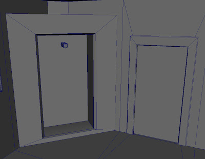
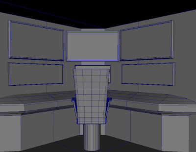
Anyway the current looming deadline (after life drawing which is friday, although currently I dont post any life drawing work here, perhaps thats something I should get around to) is the Business of Animation Module. I've found balancing the modules this term a bit tricky and I hope that everthing works out the way I planned in the end. Anyway digressing. This post is a little bit of an update on the superhero hideout. I am rather pleased with this simple environment piece, one of the two interior pieces in my animation. When I started out I started with just a few simple but hopefully visually striking features that would embody the room. As the action in the animation is going to be fast paced with lots of quick transitions I wanted the viewer to be able to read the room/scene quickly. On top of this the simple style of the animation meant that I didn't want any one shot to be too noisey with detail. I am currently just messing around with simple shaders for the texturing of different environments. I had originally planned to uv map and texture everything by hand. But this struck me as a rather large task which was quite pointless when I wasn't going to be painting any complicated textures and the viewer just needs to know what everything is. Again trying not to bog them down with details. So the plan is simple; simple shaders on everything and an ambient occlusion render pass to help high light some of the awesome simple detail in scenes like this one. Ambient occlusion helps to bed anything so it's well worth doing. Especially on high poly to low poly game geo which is normally the ball park I work in.


No comments:
Post a Comment