I've been continuing my modeling practise, and have been focusing on modeling more effeiciently. This has meant uses practises such as only using the maya hotbox and very few of the menus (simple removing the need to scroll through many menus has sped the process up quite a lot), using more and more hotkeys, only modeling half or even a quarter of the final model and using duplicate special to create the rest and using subdiv proxies again to create a running preview of the higher resolution model whilst I am building the low res. I feel this exercise has really improved my modeling skills, I am really starting to understand how to effectively use edge loops, which are key to creating good models. There is also something ridiculously satisfying about running maya and all you have on your screen is the view port and about three menus. But anyhow heres the finished render of the headphones I've been modeling.
Sunday, February 28, 2010
Friday, February 26, 2010
Tire Modelling
I've started to venture into the modelling tutorials by Escape (I was working through everything in order, but I fancied doing the modelling tutorials so I could better learn how to make something cool that I could animate), I also went straight for polygon modelling (the NURBS modelling section is a bit smaller, mainly because in my opinion its not used as much). So back to polygons it is. This model didnt really use any tools I wasn't familiar with, apart from measure which is just a ruler. But what the tutorial did teach me was how to model a lot more effeciantly and effectively. Although when it came to duplicating the original tire tread I had made to create the tire I did have to redo it a couple of times just because I needed to see which vertices didnt match up when the model was duplicated an then I would go back and adjust the individual track. All in all im rather pleased with this model, bring on bigger and more time consuming things.
Finished Animatic For They Call Me Trinity
Here is the final animatic for our character animation as we intend to make it. It is made up of three rather distinct styles as Richard,John and I each planned out a third of the animation. I guarantee in the final animation the style will be continuous. Enjoy
Thursday, February 25, 2010
Flow Path Animation
Today I've been learning a few new things, (had a very insightful webinar by escape studios, but I will probably right about that seperately), once again my animations on maya have been mainly allowing me to experiment using motion path animation (I have made a rollercoaster, and once it starts co-operating a bit better I will put up a video). In this animation I attached a model of a hammerhead shark to the motion path and used flow path to create a lattice that allows the hammerhead to bend around the motion path. I then used duplicate special to make multiple sharks whilst preserving the history of the model, once I had laid them out in a way I liked I added a camera and did a simple camera animation moving around the scene. I am aware that the scene is very dark, I only used default lighting for this I, and if i get a chance I will go back through and make more appropriate lighting. Although there is something quite cool about a shiver of sharks swimming out of a black abyss.
Hammerhead Animation from Toby Rutter on Vimeo.
Tuesday, February 23, 2010
A Bit of Video Referencing
Pretty soon our groups whole animatic should be up. But we decided that we could do with acting the animatic out to give ourselves a video reference to work from when we are animating the stopmotion characters.
Cast:
Claire: Trinity (apparantly acting a man is hard) Shock Person 1
Toby: Thin Snakey Bounty Hunter, Wounded Man, Shocked Person 2
Richard: Bar Tender, Camera Man,
John: Beefy Bounty Hunter, Robot Waiter, Shocked Person 3
Cast:
Claire: Trinity (apparantly acting a man is hard) Shock Person 1
Toby: Thin Snakey Bounty Hunter, Wounded Man, Shocked Person 2
Richard: Bar Tender, Camera Man,
John: Beefy Bounty Hunter, Robot Waiter, Shocked Person 3
Armature Kangaroo
Here is the best photo of several I took of my recently made kangaroo armature, it is ..... interesting. There were plenty of lessons learnt making this armature. One of my key learning points is that it is very important to flesh your model out a lot, and then only put plasticine over the top. otherwise the model gets really heavy and hard to animate. Also in my quest to create a durable model I doubled up wire that wasnt really bendy enough to animate the character easily. Also make sure all of hte wire armature is made first... i left the ears until last and tried to glue them on which ended badly. Final learning point came from when it came to attach the armature wire for the legs to the spine, I had some issues, and accidently may hav given too much of the tail into the spine giving it a huge long neck and not enough tail. But you live any learn. Apologizies for that of chronological-ness with this post it is definately old now
Monday, February 22, 2010
They Call Me Trinity Update
Thought I would come on this fine evening and waffle somewhat about how my groups character animation is coming along. I have lots of sketchbook work from the planning stages (the last week) that will hopefully make it onto this blog at some point, but for now they are firmly within my sketchbook. The group conviened today to decide a few things and plan in a bit more depth the events of the forth coming week. We took a look at all the character designs everyone had done for various characters and assigned who would build specific armatures. We also made the decision to work as a collective on the set, over the course of this week (tuesday, thursday and friday) and keep the armature building to our spare time. We also went through the storyboards we had made and thought about each scene suggested any changes, and happily found that the vast majority was to our liking, so bar a few minor cuts the planning stages of the animation are complete. Now all that remains is a frantic week of building characters, sets, and miniature clothing (which has rather unfortunately fell upon the only girl in our group, which is not helping us seem like an equal opportunities collective). In the next day or two I hope to post up my animatic for the opening of the piece which I have been given the task of directing, shortly after I would like to make a colour animatic to demonstrate the look and feel I hope to achieve.
Thursday, February 18, 2010
Camera Animation
I've been revisiting my good old rustic scene, now that I know how to batch render and assemble in Adobe Premiere I thought it would be a good time to go back and do some simple camera animating around my rustic scene. I haven't done anything particularly special with the camera, just a simple reveal, and if i felt like doing some more to the scene I would key frame the bump detail so it isn't too deep at the start when the camera is focused in, and also add some wobble to the camera, removing the unnatural smoothness and help give the scene some realism. There is also a few things that could be changed with the lighting to really polish the scene, but for now I'm very pleased with the way it looks.
Camera Animation from Toby Rutter on Vimeo.
I've had to edit this post, due to blogger video uploader's general incompetance and crap-ness, instead I have uploaded the video to vimeo and am just going to keep embedding the links across. The advantage of this is the much nicer size of video player, another problem with blogger's videos.
Ball Bounce
Here it is, my first exported CGI animation, I've got quite a few finished animations lined up to be batch rendered this afternoon. The reason I hadn't got round to it sooner was simpy not yet understanding how to batch render, that in itself turns out to be very simple, however finding out how to stop Adobe Premiere being super annoying is not. After wrestling with premiere for some time I finally have worked out how to import numbered stills and here you have it, my CGI ball bounce. Apologies for size, for one thing Premiere runs on 720 by something instead of 640 by 480 that maya was set to when I made the animation, this will be rectified by the next animation, also sorry that there isn't anything interesting like lighting in this one, just wanted to get them up, my Rustic Scene in which I'm going to animate the camera should be interesting tolook at.
BallBounce Export from Toby Rutter on Vimeo.
Wednesday, February 17, 2010
Creative Digital Spaces
Last Thursday we were tasked with creating an idea for a proposed use of digital space or website to either help distribute animated films, provide animation services or help teach animation to students. My group decided that we would like to design a way of aiding the distribution of animated films. We decided to concentrate particularly on short animated films and independant films. We based the idea on existing websites/ ideas and used them along with our own ideas to create the overall proposal. We decided that the website would work like youtube, Itunes, and the Apple App store. We didn't want our idea to be a direct competator with huge sites such as Youtube, but be offering a more specialised services (that still caters to a big market).
The beauty of the idea we felt that due to the internet it would allow short film developers and film makers to easily and cheaply distribute their films, we respected that a lot of money is required to make and distribute a dvd. Itunes has demonstrated this with the fact that films are sold very cheaply on Itunes in a digital form, but the artist or film maker takes much more of that money that they do out of the amount made on a dvd sale.
We also wanted people to be able to easily see films by the same film makers, that they were a fan of, or see other similar films, by way of the website making recommendations. We also wanted a rating system like the apple app store which would help publise good film makers, although we were keen to elimate comments often seen on Youtube that are neither constructive nor useful, so we suggested a standard review form on the site for videos that would elimate one line useless comments.
Finally by having a Specialist group of people that the site caters for, it would allow Industry Professionals or Advertisers searching for new styles to see what is popular in up and coming short or independant films.
They Call Me Trinity, The Plan
On Tuesday we were set our next project for the upcoming weeks, until the end of term. My group chose out of the scripts: Frankenstein, They Call Me Trinity and Doves, to animate They Call Me Trinity. This script is the opening from a western. However we've chosen to adapt it somewhat. Our "western" is to be set on a harsh, barren, red planet. The opening scene contains a scene in a Bar, which we felt gave us a chance to be really creative. With plenty to reference when it came to designing the scene, the famous bar scene from Star Wars:A New Hope, for instance. First things first we set ourselves some minor deadlines of what we would like to have achieved by each week up until our deadline. By the coming monday we want to have designed all the characters in our scene, and also have storyboarded the script. We also want to try and get an animatic together, if only a basic one. We decided that we should all make drawings and designs of all the characters and pick features or whole designs for each character based on all the groups designs. I have also spent some time thinging about the look we will be attempting to make for the exterior scenes of the planets surface. I ve been thinking about lighting. lighting colour and also just making general mood boards for the kind of colour schemes that would suit the planet. Next week we will move onto creating the characters and the sets ready to start filming the following week.
Thursday, February 11, 2010
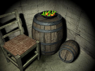
Rustic Scene Finished
This is my last render of my rustic scene in a fairly finished setup. It now has the standard three lights used in three point lighting (Key, Fill and Rim) and I have also gone back in and increased the detail on the barrels to make them look ore realistic. I altered the balance on the Key light to give the whole piece a bit of a warmer feel to the composition.
Rustic Scene
Rustic Scene
I am, as I write this composing a rustic scene using all the pieces of geometry that I have been modelling recently (barrel, tap, chair, etc). I have been working on the scene for a little while, but I hit a problem quite early on when I was making the environment and so for a good couple of days the scene remained unchanged. Today I managed to solve the problem with (error message blah something bout non manifold verticies blah) and so the scene has progressed drastically. This is a render of the scene after I had composed the shot I wanted to go for, and after I had inserted one light. I am currently going through adding more lighting effects to finish off the scene, but as it stands here is my scene light by a very soft yellow spotlight.
Saturday, February 6, 2010
More Photos
This is again a horribly late post, when I meant to post these photos from two weeks ago blogspot was having issues with me, and so I forgot. Here are some photos of another character head design, its based on a small doodle I had in my sketchbook and i fancied experimenting with a bit of a different shape of head. I was quite pleased with these.
More Texturing
Final Render with Diffuse, Bump, and Specular Maps
Model with Diffuse and Bump Textures
Model with just diffuse Textures
The UV editor part way through creating all my UVs
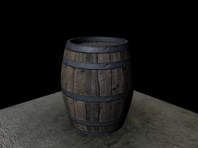
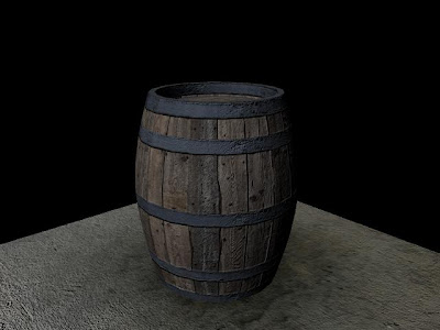
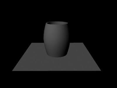
I have just finished working my way through making some simple objects and texturing them with three out of the four different types of texture maps. In the dice model I was using diffuse and bump maps to give colour and the illusion of depth. In this scene I used diffuse maps to texture the colour and detail to the barrel, bump maps to create dips and raises on the surfaces of the barrel and the concrete floor. Finally I used a specular map to alter how shiny the surface is when light hits the object. This made the metal strips on the barrel reflect light a little bit and also made the concrete floor shine as if there was a small amount of water on it. I am really pleased with the final outcomes, I really like looking at the image renders over the course of texturing and seeing how the image improved as another map was added. The only map I have yet to use is normal mapping, which is used for giving lower resolution models details taken from a higher resolution model without having to create lots of extra geometry. Also during this task I had to create my own UVs for the barrel, because I made the barrel myself from a CV curve it did not start with any UVs unlike the floor which was made from a polygon plane. So I had to select surfaces and create my own UVs to map the textures to. I ran into a little problem with the base of the barrel when I came to texture it, I realised the reason it wasn't texturing correctly was because I had had a problem selecting all the faces on the base of the barrel and this was likely to have caused the area to not be identical to the top of the barrel, which was textured without any problems.
Dice Texturing
Been playing on Maya some more, and now I'm starting to enter the world of proper textures (well more like creeping in). This is a very very basic piece of modeling (its of a cube basically) and I did jazz it up a bit with a quick bevel to make the dice look slightly more realistic. But the point of this model was to start looking at the UV editor and mapping a 2D image straight to the cube using UVs. Once I had mapped this diffuse map (thats a map that colours the model) I mapped a bump map to the surface, which gives the impression of depth to areas of the model. In this case the areas I wanted depth where the dots on the sides of the dice. This is all still very basic texturing but its a demonstation of how you start to get towards textures that will make you model look like something from the real world.
Friday, February 5, 2010
Tap Finished
Tap
I'm on a CGI roll at the moment, this is my latest creation as I am learning my way through the tools used in polygon modelling in Maya. This exercise is a box modelling exercise, the entire model is made from a polygon cube. I then applied a subdiv proxy, a feature that allows you to see a higher resolution mesh over layed with you low resolution mesh. The advantage of this is that you can alter the low resolution mesh and witness the changes to the high resolution mesh. (The first render is of the two models over layed). I just used the extrude tool and the manipulators and history to edit the mesh as I went along. In some cases using history to go back an make changes. This model is not quite finished I am about to go through and use the crease tool to make alterations to the curves that make up the tap.
Wednesday, February 3, 2010
Chair
I've been busy today learning a bit more about polygon modelling, and I have been building a chair. The chair started out as a cuboid that has been subdivided and extruded to create a chair leg. Once again using lattice deformers to alter the mesh as I went to create a bit of detail. Then I used duplication and scaling in negative axis' to repeat the legs. These where then joined together to make one chair piece. I used the extrude tool along a cv curve to create the back of the chair and more extrusions and lattices to create the rungs on the back of the chair and give them a slight bend. I added a bit of detailing with some subdivisons and extruding inside the model to create grooves in the wood. The seat cushion was simply made with a cube and altered with extrusions and with a lattice to alter the shape. Finally I have just started the process of beveling all the surfaces varying degrees (based on the hardness of the surface) to give it a more natural feel. This is a work in process as it will take me a little while to bevel the entire surface of the model, so I thought I would get a render up first. Once I have finished I would like to texture the model and also go back an maybe extrude some arms for the chair.
Textured Fruitbowl
Morning all, I've just finished doing my first bit of texturing in Maya, I really meant to get this done before now, seeing as the fruitbowl was finshed last week, but anyhow. This composition was textured using procedural texturing (texturing within Maya) and uses a combination of ramps, fractals, and some leather texture to make the effect given in the image. I am pleased with the look of the image although im very aware that the only reason I have used procedural textures is to get an understanding of basic textures, studios would not use these textures as they arent realistic, and much better and more natural textures can be achieved using photos, photoshop and a UV map of the image or character that you are texturing. Also I have only used diffuse textures in this render. As a result the image looks fairly flat, because it is lacking specialist lighting, and maps to tell the camera how shiny or smooth a surface is etc. Even though there is a long way to go before my textures are at a professional or studio standard and pleased to have done so much already, and I cant wait to get into doing complex shaders and lighting.
Subscribe to:
Posts (Atom)