This is the reference video i recorded to get an idea of lip shapes during a speech, i was a little bit embarrassed as i was doing it in front of a few people, and the eyes reflect this, however for the purpose of just looking at mouth shapes it suffices.
Friday, November 27, 2009
Photo Storyboard
Second Storyboard
More Planning
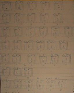
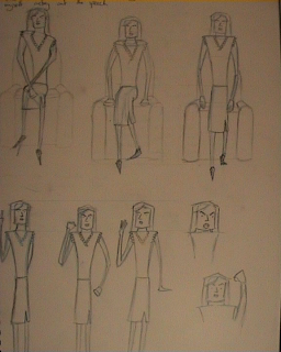
In order to make the best possible animation i wanted to do as much planning as possible so i chose to plan the breakdowns of various complex actions within my animation, such as the character standing up from the chair. I also was quite ambitious and decided that i wanted to perform a lip sync with the character and the audio as i felt this would really bring the character and the piece to life, so i planned out all the different mouth shapes used in the piece, taking reference from the animators survival guide by richard williams and also cartooon animation by preston blair.
Character Design 2
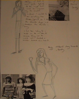
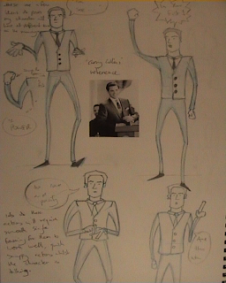
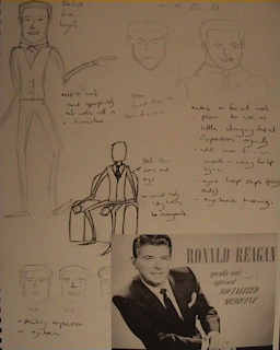
These are my later character design sheets, including some of the reference images that gave me my ideas. Towards the end of the process i decided my character was very stereotypical for the audio and seeing as i had the ability to create what ever visuals i wanted i decided i should try and make a very different character to that of the audio. As a result of me wanting to change the character but liking the character's body shape too much to get rid of it i chose to make my evil dictator a twisted man who liked to dress as a housewife, the result i felt worked as the image and the audio still work together but are rather obscure.
Character Design 1
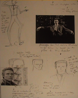
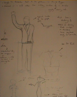
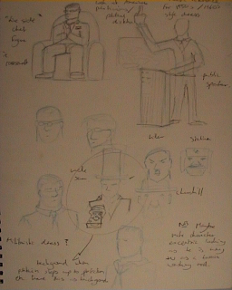
These are my first three pages of character design it all starts with fairly simple concepts, or fairly complicated in some cases, once i found roughly what i was looking for it was a case of simplifying the character to simple shakes with bits of detail so it would be easily draw over and over again
Planning
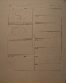
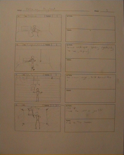
This is the first of several upcoming planning posts, all of this was done before I started to animate at the start of the week, this post contains my preliminary storyboard which just contained the actions I had planned for the character although at that point I hadn't finalized the character design. I started my planning by listening to the audio clip and recording all the information on a dope sheet, then I started character design and planning all the actions that would take place, followed by my first storyboard, I recorded some live action reference images and videos and then once the character was devised created a second more detailed storyboard followed by an animatic.
Wednesday, November 25, 2009
Rough with Audio
This is it, the whole rough animation tested avec audio, I think it all lines up well, the glories of Dopesheet saw to that, its just needs polishing in the form of keeping consistant volume and some detail, add a bit of lip sync and the background I have planned and I think it should look good. Enjoy.
Scene Tests
After much drawing I decided to film tests of whole scenes, these are the rough drawings that im testing, currently I am going through and drawing in detail and making sure that the volume of my character stays consistant from frame to frame, so if you spot any problems would be great to know so I can amend them as I work through. Once I have gone through all the frames adding the detail and checking consistancy I will lip sync the whole piece, as im sure you will have noticed these tests are missing faces making certain scenes that focus on it very dull indeed. And once the lip sync is complete i will ink the entire animation and then hopefully you ll see some colour as well.
More Tests
This isnt going to contain much fruitful wisdom, just more tests as the title suggests funnily enough. The second test is from the second scene which is more of a mid shot with my character standing central. The first test is of my character signature fist clenching whenever the word power is mentioned, it ll become more apparant once the sound is added.
Tests
These are a series of tests I have performed so far of my draft character moving as planned on my dope sheet, not current with audio for most of these clips they were just movement tests. One or two clips have had the audio put behind them and will be appearing later on. The leg during the standing tests goes a bit strange (looks like a car hit it) but does get remedied in later tests.
After ridiculous amounts of planning (which will be posted to prove im not lying) I finalised a character design (the evil dictator who happens to like wearing womens clothes) and drew some larger (although not much) storyboards and filmed them in sync with the audio track to give you this animatic that outlines in brief the plan for my animation. Enjoy, its a little bit out of sync with the flag descending but other than that its alright. Its only a brief animatic after all, if i wasnt in such a huge rush to finish the actual piece i wanted to create a moving animatic on Adobe After Effects.
Spirited Away
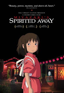 I have recently watch for the second time Miyazaki's Spirited Away, I was struck instantly by how beautiful the visuals are in the film and I think the first time I watched it I didn't pay enough attention to the films visuals and instead just catagorized it with all the anime films I had seen previously. This was a huge mistake, for two reasons first of all the drawings and scenes of Spirited Away are truely spectacular in their own right and secondly is the clever but very subtle use of cgi within this animated film.
 I have also just watch Origin-Spirits of the Past on a recommendation and I it useful to compare both films. Particularly on the use of cgi within them. Both choose to animate certain areas of the film with cgi, in Origin it is the huge industrial and war machines of Ragnar wheres Spirited Away purposefully kept the cgi lower key so that it "didn't steal the show" using it for hte large expences of water and other areas. Its not just the way that its used for two different areas in the films that interests me, it is how in Spirited Away it is so well blended into the handrawn animation. You can hardly tell which bits of the film are done with cgi programs, to the point that the first time I watched the film I don't think i noticed it at all.
These two films share a lot of similarities particularly in their message. Studio Ghibli always have quite environmentally themed messages in their films, notabley Princess Monoko along with Spirited Away. I felt it was particularly well illustrated in Spirited Away in the scene when Gehiro is washing the sludge spirit and pulls the handle of a bicycle out of the spirit drawing out a huge pile of rubbish revealing that it was in fact a river spirit that had been polluted by humans. This expressed the message about humans mistreating the environment perfectly. Origins does similarly in its entire backstory and takes this as the setting for the film, the forest took the abuse of humanity until it decided to save itself by becoming hostile towards humity. The role reversal almost of humanity destroying the environment I found really portrayed the message that it should be treated with more respect.
Sunday, November 22, 2009
CGI 2
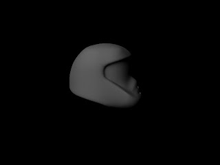
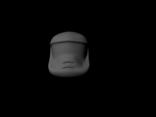
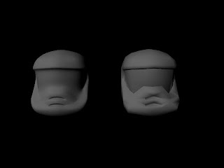
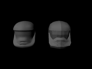
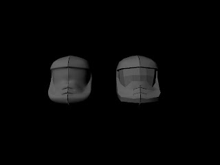
My next bit of CGI modelling, again this is all polygon modelling, I started with a basic cube shape and added subdivisions before carving a basic helmet shape out of it by deleting faces. From that I matched the verticies up to a pair of reference images and extended my shape until I had a basic shape of the helmet. Then I drew a second polgon as the profile of the jaw of the Helmet and extruded that to make it 3D before using the bridge tool to connect the two parts of the mest. Then I filled in the visor of the Helmet. I then went through making some of the polygons a bit neater. Then mirrored the symmetry to get the whole mesh, as you can see in one of the renders there was a small gap between the two halves of the mesh, this was due to a vertex not being properly aligned to the grid, so I went back over to remove the problem. I then used subdiv proxy to show a higher divisions polygon simaltanouesly to the low number of polygon mesh allowing me to make changes such as soften edges, harden edges and crease to the low resolution polygon but see the effects on the higher number of polygons mesh. This mesh was really shoddily contructed I should be so much less messy, I think there are a few polygons that are only three sides, lots of unnessecary lines. Next time I need to really work on cleaning up the model and spend a lot of time on it as thats what gives a model good visions not just smoothing it to cover up bad work.
Thursday, November 19, 2009
A Scanner Darkly
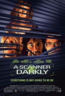 A Scanner Darky is based on the book by Philip K. Dick in which tells the story of a group of drug using friends based on Philip K. Dick's own experiences as a drug user and the experiences of his friends. The story takes place seven years from now and tells the story of an undercover narcotics agent who is simaltaneously an addict. The interested me in several ways, first of all the fact that the film was adapted in two ways. Originally a book adapted to a live action film, and then Richard Linklater had decided that the film would be animated through a technique very similar to rotorscoping allowing the entire film to have a cel shaded effect. This was no small task and did take 18 months of post production and over 350 man hours per minute of film. But the result is fantastic giving the film its very own individual style, and the style of the visuals really helps the complexities of the story. Due to the fact that throughout the film many of the characters are hallucinating it helps that the look of the film is consitant through these hallucinations and also when something is really happening. Because the alternative to this would have been to use CGI to create the hallucinations it would have been far too obvious when a character was hallucinating when perhaps for the purpose of story it shouldn't have been. The film did have some slow points in terms of narrative and particularly character dialogue, the problem with the entire set of characters being high throughout the film is that their conversations, whilst being what is needed for the story, are a little bit hard to follow or just make a lot less sense than a normal conversation. However as the film nears the end I found that the story really came together and personally I loved the ending so it was definately worth watching all the pointless at times conversations to get there.
Wednesday, November 18, 2009
Favourite Flip Shorts
There were a large number of the Flip Animation Festival Shorts that I really liked for various reasons. Of the first set of shorts Escale by Elea Gobbe-Mevellec struck me as an incredibly beautiful piece of animation. The story itself was very touching, but the style in which it was presented was even more impressive it was handrawn with a very simplistic style of line at times, especially when it came to drawing the faces of characters however the rest of the image retained a lot of detail. Scenes in the bar, where the sailors spent time when at port, were amusing especially the relationships between the women and the patrons of the bar.
Also from the first set was Deadline by Bang-yao Liu, this piece was impressive as it was shot in stop motion with the animator working at his desk and the animation being made on the wall above him using only post-it notes. The use of post-it notes gave the things he was animating a really pixelated feel, but none the less looked very different due to the use of the different medium. This was the main reason i liked the piece because of its unusual style and for using a material not normally used in animation. Also sections when the character of the animator was interacting with the post-its on the wall.
In the second set of shorts I watched I particularly like "the Hidden life of the burrowing Owl" by Mike Roush. The layout of the animation as a documentary was a nice touch. But what struck me as a brilliant idea was the parts of the story was the sections when the character of the burrowing owl acted in the opposite way to which the observer thought the species should act. The ending in particular when the burrowing owl, instead of hiding like he should attacks the car that killed his mate was rather ironic and ended the piece with me laughing because of it. For these reasons I thought it was a really good piece of animation.
The Final short I am going to talk about was from the Brother's Mcloed's ten animated films that had influenced them in certain ways. I found two of the shorts on their list rather disturbing, the Adventures of Pocketboy for the obvious reason that I was warned about before hand when the brothers Mcloed said "if yo u have an aversion to plastercine penises please leave now". But the other film that I wasn't so keen on was Suzi Templeton's Dog, the short film was incredibly dark and bleak and despite the animation being very good did nothing but depress and disturn me when the boys father tries to smother the dog to death and failing that caves the dogs head in with a lamp. The culmination of the entire piece I didn't find enjoyable at all because it was relentless in how depressing it was.
Tuesday, November 17, 2009
First Day of Maya
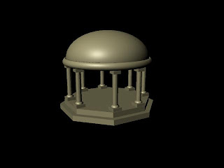
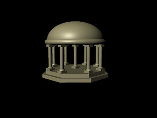
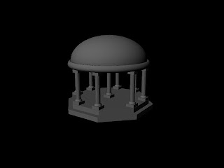
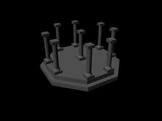
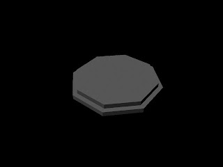 Maya arrived today and has now been installed so I thought I would start having a crack at the tutorials included in the handbook, for a start modelling a small temple using polygons and nurbs. It's all very simple stuff, I took renders as I worked my way though, and when I got to the end did a very simple bit of shading, no textures just a standard blinn properties shade. It's good just to have a play around and get the hand of shortcuts and dashboard as the last 3D program I used was 3D Studio Max. I want to move on from this to something a smidge more complicated maybe get round to making so real looking textures for it, but we'll see where it goes.
Sunday, November 15, 2009
Audio Assessment
This is the first of my posts concerning my next assessed piece, for the brief we were tasked to choose an audio clip out of several choices and animate in time with the clip. I chose a piece which has a character performing a monologue about the power of television. The clip instantly reminded of 1950s/60s political addresses of charismatic politicians or dictators. Particularly of the opening speech from Andrew Ryan at the start of the videogame BioShock. I have referenced this as an audio influence on the character I have created from listening to the clip. I very much wanted to keep the theme of a powerful politician or dictator, and the line "minds turn to jelly" makes me think of using the power of TV to brainwash, whether it be subliminal messaging or something more sinister. I felt this would be a really good premise for my animation and from this I will animate my leader giving a public address via a TV.
Unfortunately I haven't worked out how to embed sound only files on the blog pages yet and so this post will be missing the audio clip im using and the Andrew Ryan speech reference.
Unfortunately I haven't worked out how to embed sound only files on the blog pages yet and so this post will be missing the audio clip im using and the Andrew Ryan speech reference.
Wednesday, November 11, 2009
Flip Animation Shorts 2
Listen To ME!-Elena Rogova
Lily & Ermine-Frances Lewtas
Kudan-Taku Kimura
Noesis-Sophie Klevenow
Rabbit Punch-Kristian Andrews
Magic Theatre-Jordan Harvey
The Hidden Life of The Burrowing Owl-Mmike Roush
Fot 'The Next Big Thing'-Alex Dron
STINKS-Qianqian Liu
POST!-Christine Asmussen, Matthias Bruhn
Man Up-Ed Barrett
Touche-Trevor Hardy
Special Glue and other Stories-Andy Sykes
Flip Animation Shorts 3
She Farted and Created the World-Scott Coello
This is Where we Live-Ben Falk & Joshiah Newbolt
Sparni un Airi (wings and oars)-Vladmir Leschiov
Damaged Goods-Barnaby Barford
A Record of Life-Owen Gatley & Luke Jinks
The Seed-Johnny Kelly
A Film About Poo-Emily Howells & Anne Wilkins
The Terrible Thing of Alpha 9-Jake Armstrong
The Argonaut-Marcin Wasilewski
We Are All Here-Yonghwa Choi
No Corras Tanto (take it easy)-Cesar Diaz Melendez
The Black Dog's Progress-Stephen Irwin
Frequenze Animate #1-Michela Donini, Roberto Paganelli, Andrea Martignoni
Umbilical-Rowan Gray
Unplugged-Stjepan Mihaljevic
Wishful Expectations-Richard Webb
Flip Animation Shorts 1
This is going to be a really boring post but its for anyone who didn't get all the sheets for open shorts 1,2 and 3 from Flip Animation Festival
Open Shorts 1
Housewife-Linda Barlow
Il Gioco De Silenzio (the play of silence) Virginia Mori
Ant & Len- Duncan Raitt & Jon Marsh
Ex- E.T - Lasfas Yannick & Gracia Nicolas
A Peacock's Tale- Anna Humphries
A Traditional Christmas at Small Birds Singing- Linda McCarthy
Hot Dog- Bill Plympton
Breaking the Mould- Rebecca Manley & Luca Paulli
Escale-Elea Gobbe-Mevellec
Deadline- Bang-yao Liu
The legend of Geb and Nut- Laura Ratta
The Astronomer's Dream0 Malcolm Sutherland
Jelly Fishers-Steven Subotnick
Sita Sings the Blues
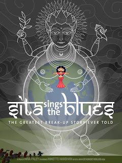 Sita Sings the Blues is a fantastic piece of animation. The entire animation as a piece is rather complicated as it contains two parallel storyline and three different animated styles. Although i felt the combination of different animated styles really lends itself well to the piece, I also was impressed by the modern take on the story of Rama and Sita, not least the choice to tell part of the story through blues songs alone. The story is narrated by three figures and tell part of the story of Rama and Sita, the animation is fairly simplistic in these sections, apart from on the narrators, as the characters appear to be cut out images that are moved as whole images. However the purpose of these sections of the film is to explain simply the story, making the film very accessable for those who don't know the story well or even at all. The second style of Animation is a much more detailed and individual take on the design of the characters from the story of Rama and Sita, and although they look different to the same characters they represent in the narration they look similar enough to avoid confusion. The really interesting feature is the choice to set it musically to a soundtrack of blues songs to tell the story from Sita's point of view. The final style of animation is also the parrallel story which takes place in modern times in a combination of the western world and india, and as such has a very different style of animation to the other areas of the film. The parrallel story tells the story of Rama and Sita in a modern context. As a result the Animated film does wonders for an old tale, in modernising the original story with more recent music and also doing a completely modernised version.
 I have been concentrating some what on looking at the sound in animation at the moment and Sita Sings the Blues really intrigues me from this point of view, the choice to tell a story in the style of a musical but with songs that where written hundreds of years afterwards is an inspired idea. And the choice of blues songs do really help to convery Sita's emotions and the story. Whilst it doesn't do anything as daring as having a feature length film with no dialogue for the first forty minutes, Sita Sings the Blues is a very different approach to telling classic tale and uses sound superbly
Thursday, November 5, 2009
Exaggerated Face Cycle Take Two
I had a bit of spare time this week what with assessment being over on tuesday, so I took the time to go back over and ink my exaggeration cycle and re shoot it. I had a couple of aims, firstly to drastically change the timing and spacing on the piece, because when it was originally shot I logically gave each expression an even amount of time, I learnt about the principles of timing and spacing the following week and feel that especially some of the angry expressions could really do with a bit more speed. I also wanted to colour the animation in, as I feel my colouring skills on the computer could do with a bit more refining. However I spent all day trying to be clever and use photoshop's automate tool to make my work so much easier that I havent got round to colouring it yet. Automate works really well for some things (ie changing the brightness/contrast of 78 frames very quickly) but sadly what I was asking it to do was probably a bit much, or I wasn't asking right. But here is the video with better timing and spacing hopefully colour will come soon.
Wednesday, November 4, 2009
La Voyage dans la Lune
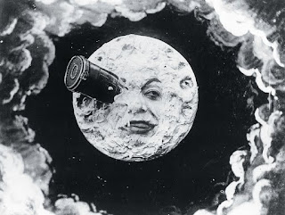
La Voyage dans la Lune, translates to a Trip to the Moon, is a short black and white film directed and filmed by George Mellies in 1902. Mellies is in many ways a pioneer of a variety of modern special effects. He began his career as a stage magician before progressing into becoming a film maker. Mellies loved the magic of film making, and was in many ways obsessed with illusion. It was these illusions in his films that made them so impressive. On film he could perform many tricks a magician could but even easier and in completely different context. He discovered what became known as the "mid shot trick" when film jammed on one of his early cameras. This special effect allowed Mellies to give the illusion of the magician disappearing and reappearing a woman. Because Mellies was a master of stage arts and how to get the best out of a theatre production from his time running the Robert Houdan theatre, coupled with his knowledge of his special effects, his films really were ahead of their time in many ways. In one of Mellies films he is credited from using double exposure and splicing film back together, only he exposed the reel of film seven times. This is so significant for me as this effect that Mellies was using in the 1930's was still considered state of the art special effects when it was used by the special effects team working on Star Wars in 1977, thats how far ahead of his time Mellies was.
La Voyage dans la Lune was filmed with a mix of live action film and painting sets. Much the same as a theatre production uses a set and actors. This was Mellies signature style by this point. There were also a number of other points in the film that highlight it as Mellies, for instance the use of actors and actresses as the stars and other planets. Not only this but the short film, running only eight minutes long on 25 frames a second, has had a large influence in popular culture. Everything from rock group Smashing Pumpkins very Mellies inspired music video for the song tonight tonight to comedy from the Mighty Boosh making use of Mellies moon with a face.
Pencils to Pixels
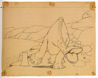
Pencils to Pixels details the history of classical cel animation all the way up to digital animation and even 3D animation pioneered by Pixar. One of the earliest animation's was Walter McKay's Gertie the Dinosaur in which Walter McKay himself intereacted with the moving animation of his dinosaur Gertie. McKay would talk to Gertie calling her over to him and offering her an apple that was thrown onto the screen. After Gertie the Dinosaur came the first animated superstar Felix the Cat who inspired a generations worth of animated characters. Felix was also the first animated character to be anthropomorphized, by which an animal was given human characteristics. Animation improved in leaps and bounds Walt Disney's Steam Boat Willie, the first animation with recorded sound rather than live music being played in time with the animation, inspired Walt Disney to create the first full length animated film Snow White in 1936. The project took four years to complete, with 600 animators working on the 83 minutes film. The work was so intense that some animators booked themselves into hospital in time for the end of filming. Disney followed the Success of Snow White with Bambi in 1942, and continued to make cel animated films for years. But in 1995 a new form of animation was discovered. Pixar animation studios was bought from Lucas Arts for $10 million by Steve Jobs, head of Apple, John Lasseter took Computer Animation which was largely developed as a science rather than an art form and applied the prinicples of animation to his work, the result was the short Luxo Lamp. This short was very successful and it allowed Pixar to work on their first feature length animation Toy Story, Pixar made the largest change to animation in 60 years and like Disney had completely revolutionised the art form. Film makers Dreamworks have criticized Cel animation claiming that the art form is dead, but with Disney returning to the Cel roots on thier next feature length film and studios such as Studio Gihbli making animations such as Spirited Away, Princess Monoko a new benchmark has been raised for the Cel Animation industry and it looks that for many years it is anything but dead.
A Bit of Extra Colouring
After i finished my animation for task five, I inked the animation and started colouring it in photoshop. For reasons I'm still not sure why the camera has a huge problem recording images of lines that aren't fuzzy even when I ink the animation. As a result I resorted to using threshold on photoshop to make the image black and white and have more solid lines. This did however mean that the image has a quite pixelated edge to it. I can't decide if i like it or not, I would prefer it if it had been a clean line like originally intended, but there is something quite querky about the animation's style now. Also my "brilliant" plan with after effects wasn't quite thought through well enough, I thought that if i drew the wall mount on the background and on the animation I could just stop drawing it in the animation when the guitar jumps from the wall, however it did forget i was animating the wall mount a bit and as a result the two dont match up. It's not very obvious on this video but its there.
Sunday, November 1, 2009
Assessment Animation
This is the video of all the different elements of my Assessment Animation assembled together. I am overall quite pleased with it, particularly the last section involving the walk cycle and the turn on the spot, however there are a few things that need to be addressed, timing in certain areas and a few frames are missing at the end of the film.
Turn Test
This video is a test of my character's turn on the spot, it was the only bit of the entire full animation done in straight ahead animation and I had to act his out a lot to get it looking right but it was actually a lot easier than I expected. As i mentioned i referenced my own feet and legs to get an idea of how someone would turn on the spot one step at a time. Shading one of the legs in really helped with both the turn and the walk cycle to not get confused when drawing. Now that I've finished the turn I will remove the shading though. Also the guitar disappearing at the start was intentional at this point, I wasnt sure whether to draw it in every frame yet if the turn was going to go wrong I didn't want to have lots more guitars to remove and redraw so i left the first frame from the previous scene and let it disappear until i had managed to animate the turn, then went back and drew the guitar into the frames, as can be seen in the final version.
Assessment Character Looking Around
This test is the complete section in which my character is looking around. I was very pleased with the timing of the necks movement and also the points when it pauses, i feel this really gives off the impression that the character is looking around and is exploring the space it is within.
I was also pleased because i feel that the character's neck doesn't change too much in volume as it moves around, I found this particularly hard as i had to draw acurate arcs and try and keep the same width and shape even though the neck was bending. So I am particularly pleased with the finished result in this case.
Subscribe to:
Comments (Atom)


