It's time for a quick update of how my little witchdoctor side project is going (I think quite well, but I'll let you judge). This is my first attempt at using zbrush on a character I have designed and also my first attempt at using normal maps (already since starting this I have decided on a different work flow I will be using in the futute for the creation of my real time characters). I havent spent as much time on this guy recently as the game work I've been doing for uni has somewhat taken over my life. The images below are split into 3 categories high poly zbrush sculpt of the character (no where near as high poly as I could go), low poly character models in Maya with the normal map of the high poly applied, and finally a preview of the colour map, which at his stage is just block colour, ambient occlusion mapped from the high poly details, and the start of a denim pattern that will be used on his jeans and canvas bag. Enjoy.
Wednesday, December 22, 2010
Saturday, December 11, 2010
Cargo Containers
I started modelling a shipping/cargo container a little while ago to be used as a game asset. All was going well but I hit one major problem. In creating all the extrusions to give the container the nice textured feel, the polycount was getting very high (roughly 3000 triangles) this was a bit (understatement) much. So now that I am back in full game mode, I decided to have a play around again and came up with a slightly ingenius way of lowering the polycount, and have now managed to get it down as low as 509. Without losing any detail or creating strange n-gons. This is a much more managable number. As all ground level crates or crates the player will be near/ come into contact with can be these 500 poly ones and any that are inaccessable can be a simple cube the same size with the same texture applied (this works very well at a distance). Thus allowing us to stack up loads of crates if we feel it will create a nice aesthetic without racking up insance poly counts. This is the aim with all the assets I am creating. To try and work out how much the player will come into contact and how much I can cheat.
Redonkulously high poly image (actually has LESS detail than the top image)
Basic Texturing
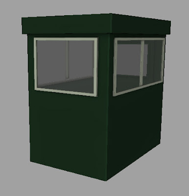
What with assessment now over my attention is once again completely concentrated on the digital animation project. In theoy there will be lots of posts next week, as we are going to do a huge lets get stuff done session and be at uni every day. As you may have seen I've been beginning to UV map and texture characters, by way of previewing what they will look like. And I am slowly working in details to those character textures. I have also started contributing more assets to the game, now that my rig is finished (which the exception of those pesky fingers). Here is one of the assets I built (its very low poly under 500) and is a security booth that will soon have a barrier to accompany it. I have this morning UV mapped it and painted a basic flat colour to it. Then mapped the AO over the top. The next step is for me to paint in the material properties (ie make it look like its been made of some sheet metal and plastic for the window frames). And then the fun can really start, by this I mean the texture distressing making this booth look like its been scratched, burnt out and generally wrecked.
Monday, December 6, 2010
Texturing Preview
Here is one area of my progress with my game work (there has also been rigging progress and other such progress which looks less snazy as a screenshot, so that will remain as it often does hidden underneath the character meshes maintaining the illusion that they move by magic). This is the very very (did i mention very) basic blocking in of the colours so I can quickly tell which area of the mesh is which and the base colour that is going to be. The astute among you will notice that the henchmans mesh has lots of black on it, this is down to the ambient occlusion map that I have baked as a texture (baking it allows me to use it in game) this shows me areas of shadow, for example the dark lines on the torso showing me that no light reaches this area as its covered in bag strap. I like getting these basic blocks in (as it means texturing has officially started and it starts to give you a preview of the character) I will over the next few days/weeks be adding lots of detail, texture, distressing etc to these texture maps, creating a bump and spec map for each (as well as the AO map that clip is missing) and if we get lucky with time I may eventually normal map the characters for that extra bit of detail.
Animatic
Here it is, there have been many storyboard posts, but finally a working animatic, I really felt that adding the sounds helped bring the story (if you can call it that) alive. Those of you who also had the group two sounds will notice I added a few at the end such as the lighting noises and the theme tune from the archers. I am quite pleased with it, in an ideal world it would also be done as a wonderful colour animatic. And hey you never know I might have time to tomorrow.
Animatic from Toby Rutter on Vimeo.
Saturday, December 4, 2010
Another Storyboard
Yet another storyboard, with minor changes, a bit of ink etc. As the storyboard drafts have slowly changed in places and order things have had to be added and taken away. But I think this will be the final update unless I feel the urge to redo it again before wednesday. I am currently putting together the animatic, avec sounds, and its looking really nice, and also making more and more sense when you add the sound. I am thinking of going away and looking for some more sounds to add to fill the gaps that the sounds used to get the initial idea did not cover. Apparantly we arent bound by them, we were just experimenting with a new idea of coming up with a concept from sound and then iterating the ideas in terms of storyboard and screenplay revisions. Which I feel has worked really well.
Friday, December 3, 2010
Character Update
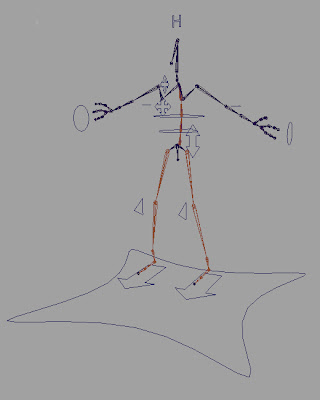
I thought it was time for another blog update, I'm actually finding it hard to find the time to stop working to document all the work I am doing. It's assessment week for narrative next week so thats all a bit hectic, but we are also nearing day by day the january deadline for the game demo, and what with christmas hols just round the corner I am keen to motivate my group that anything done before christmas doesn't have to be done over christmas. That said everything is starting to fall into place a bit more. So here is a little bit of what I was working today. We have an image of Clip our protagonist, and I know the model looks very similar to the last models I have posted of him, but there have been some subtle differences. With the exception of his previously rather ladylike lower body and waist done of the actual shapes have change. For instance you probably wouldnt notice from looking at it that I completely remodelled the face today, to a lower polygon topology and a much cleaner one. I have also remodelled the torso jacket from scratch to again change the topology to a better one for deformation. I also went through and managed to reduce the overall polygon count by about 2000, although some of this has been re-invested. The reason for this is one wednesday I got the game group to test my rig (version one) out and test the semi skinned character. We managed to find plenty of areas with room for improvement both in mesh and rig. And hopefully now some of these have been rectified with the Clip remodel and the WIP of rig version two complete with much better feel, hands, controllers and more. Anyway I have waffled enough.
Subscribe to:
Posts (Atom)