Wednesday, December 16, 2009

Draft Layout


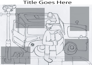
This is the draft of the layout for my critical analysis piece, I am writing a short history of Aardman animation with a bit of a focus on the work of Nick Park. On Tuesday I went to see the Wallace and Gromit exhibition at the Herbert Art Gallery/Museum in Coventry, here they had on display a number of sets and pieces from Wallace and Gromit's Curse of the Were-Rabbit. The sets were amazingly detailed and I made some sketches of them as I walked around, I picked one of my better sketches to be the background image for this piece. It was simply Wallace getting out of the Anti-Pesto Van. I chose it because unlike most of the other sketches I got nearly the complete scene on the page, whereas I couldnt do justice to some of the others because of the raw level of detail in some of the sets.

On the piece I have begun to draft in where blocks of text/ images will be along with where my title will go as I have yet to decide on an exact wording of the title. I like the opaque boxes as it enables the audience to still view the image and it doesnt break it up too much, so i think i will keep it like that when i start to add the information, although i may alter colours. The whole piece is sized as an A3 piece of paper which may not be clear from this image.

Tuesday, December 15, 2009

CGI - 3D Studio Max


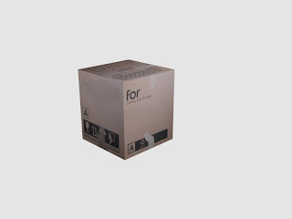
This is a bit of CGI modelling I've been doing on 3D studio max, it was part of the Autodesk creative suite and i thought see as I had a book on modelling in it I would start to work my way through that at the same time as Maya and also trying to finish my task for blitz games in order to try and get a student open day. . . I'm going to have a work heavy christmas. Anyway I only took one render from this exercise because for the most part its very very simple, its just a standard cube but I took the time to try and understand using diffuse maps on 3D studio max to use photos to texture the image. This is the result, I got the hang of it quite early on but had to redo it as there were a few teething problems but here is my finished cardboard box.

CGI 3 - continued


Here are the last couple of renders from the previous post, blogger doesnt like more than five photos at a time.


CGI 3


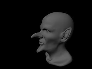
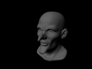
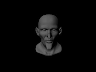
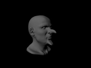
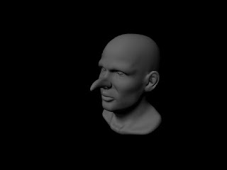
Ok so its been quite a while since I posted any of my on going CGI work, this load of renders were done quite some time ago but the final animation task of the term got in the way of uploading them. They were all done in Maya, sadly I did not create the head mesh only edited, this is again another exercise that I am doing out of the Maya getting started tutorials. In this tutorial I was using soft select and altering falloff along with the move, scale and rotate tools in order to edit the mesh of the human head and make it look like a muchos more evil goblin. Enjoy.

Sunday, December 6, 2009

Final Audio Assessment Video

Where to start, well I just about finished this piece despite working solidly on it and the planning for the last four weeks, i realise that maybe I set out wanting to accomplish too much for the time I had to do it in. So this final piece is in my mind what I wanted as the finished piece. Its mainly missing a LOT of post production elements that I wanted to add in, obviously I think I made the right decision when it came down to do I spend more time working on the animation or more time making it look all pretty at the end, you should always make sure the animation itself is good quality before making it all shiny looking. In some ways I am quite pleased with the animation but I am having a huge case of "if I did it all again I would do it soo much better", I am pleased that I managed to make the lip sync work, and thanks to the dope sheet drawing and syncing the actions and lips to the sound was a doddle, saved me so much time. But I feel the piece lacks the level of acting it should have, the lip sync could be made more realistic with jaw movement and accents on important vowels, the acting of the piece could be greatly improved by adding facial expression animations on top of the lip sync, which are all but none existant in this piece.
Another key area thats bugged me was the fact that some details such as the hair werent roughed in and were only put in at the end and so I dont think they hold the volume very well at all throughout the piece, this brings me on to the body which kept volume well but I feel I may have left it too static in places to make my life easier and I think it possibly should be moving more throughout the piece.
Now on to problems with post production and after animation elements, I originally planned to colour the animation and then sepia tone it so I could get the very 1950s feel I was aiming for, and as a result I wanted to ink it to get the best lines possible first, but about halfway through the inking I realised there was no way I would have any work to submit if I continued trying to ink and colour it. I still wanted to salvage and use as much of my idea with changing backgrounds during the piece as I could but this proved to be impossible without making the animation look very bad as i couldnt key colour out in aftereffects if I hadnt filled the character with colour. I think that is most of my rant about how the piece isnt quite what I was aiming for, but I am pleased with the lips and gestures, and by the way the character is an evil dictator who likes to wear womens clothing apologies if thats not clear. And with out further ado the final piece:
Wednesday, December 2, 2009

Lip Sync Test

This is the first scene of my audio assessment animation tested with the lip in sync to the sound. Im very pleased with how well the sound and the mouth movements match up, although because of the rough drawings at this stage it can be hard to see on the small screen.


There have been other lip sync tests as time went on but i found it difficult to test short sections of lip sync as i would with short scenes of animation. As it involved trying to line up exactly a very small amount of the total 11 second clip, so more often than not i tested whole scenes. I dont want to post them all though and give away the surprise of the whole piece.

Audio Assessment Tests

These are the first of my many tests done over the course of the animation, a this point they are just rough blue pencil drawings of the body movements. I drew out all the gestic animation and followed this up by adding the lip syncs.