Saturday, October 31, 2009

Walk Cycle Test


This is a test from the walk cycle i have been drawing for my assessment animation for when the guitar's owner enters. However this walk cycle was only done with the key positions in the walk and no inbetweens, as such it is quite quick and for the second test i went back through adding the correct number of inbetweens to make the walk look in time with the rest of the animation it was going to be shown as part of.


As reference for the walk I used diagrams from Richard William's Animators Survival Guide and also a series of still images taken by Eadweard Muybridge, featured below.
Bouncing Ball Final Animation

This is a rather delayed post of the final animation of my bouncing ball, I had some issues exporting it the first time round and it looked like a polar bear in a snow storm. The picture is
still not a brilliant quality i think it is because the animation paper it very thin and could do with a white background underneath so it doesn't look so transparant. The animation im pleased with i think the squash and stretch prinicple being used works well and i feel that the timing and arcs give a realistic feel to the ball. However I would like to do it again soon and make some changes to the ground through the animation and perhaps add extract balls and make the animation a bit more complicated.

Further Tests

These are the next two tests for my Assessment Piece. The first of which is just a second version
of my first test with some minor alterations including a few changes to timing. The second test is the first test of the Character examining the ground after it jumps from the wall. I found it more difficult trying to get good arcs when bending the guitar neck and also had to be carefully to keep the volume consistant throughout the animation. But overall im quite pleased with the test of the first few head turns, when all the head movements are animated you get a much better sense of timing and spacing as it performs different movements with varying speeds.


Assessment Animation

This is the first test video for my assessment piece, the piece is very influenced by Pixar's Toy Story and also one of Pixar's early shorts the Luxo Lamp. The animation tells the story of a guitar coming to life when its owner isn't around and it this test shows its epic struggle to get off its wall mount. I was quite pleased with this as a first test, it was the first time i had ever tried to animate and inanimate object and try and give it character. The timing isn't very realistic on this test although in later tests I did try to remedy this and add pauses and vary the pace of actions when it was needed. I also used a bit of squash and stretch principle when i was trying to build anticipation for the jump off the wall. Again I don't feel like this test go quite far enough and in future ones i add a bit for action as anticipation and also a pause to show a build up before the jump.


Thursday, October 22, 2009

The Final Jump

This is the finished Jump, background, colour and all (and hopefully blogger won't have changed the colour once i ve uploaded it) After dealing with a change in background colour I had no issues compositing the background image and quick time movie together in after effects. If I had a chance to do it again I would do several things, firstly not pick an arm colour that is close to the colour of the paper and be forced to change the entire background colour (that would remove the strange white glow around the character) I would also put a second small bounce at the end of the jump as I'm not convinced the current fall looks very realistic. Although it looks funny which is always useful when you have to stay awake into the early hours finishing something.

First Attempt at Colouring Animation

After I finished detailing my jumping viking I black fine lined all the drawings and got rid of draft lines, re shot the animation and started to colour the animation in photoshop. I've discovered several things a) takes quite a while b) make sure your lines are nice and hard without being really thick otherwise the edges can look a bit hazy or you have to close up some gaps to block fill easily. I finished it all to a level i was happy with and performed a test in Adobe After Effects but found that my choice of sleeve colour was too close to the colour of the paper had turned under lighting. As a result i had to back through photoshop editing all the background to a white one, at least the lighting of my images had been fairly flat otherwise I would have required a lot more work to replace the background colour. But it isn't a good idea to plan to change the background colour to key it out, its much easier to make sure none of your character colours are too close to the background colour because the characters edges won't be as clean after the background colour changes.


Wednesday, October 21, 2009

Jump Test

This is the video from my first jump test, the character will be jumping over of a crevice, but that hasn't been drawn in yet as im experimenting with using adobe after effects to only have one drawing of the background thus saving me loads of drawing work. I started by looking at the body of the character as a ball and plotting the course of the body using key frames and planning pose-to-pose animation. i then created the rest of the body and built it up until i had the simple outline, once I had got to this stage I performed a line test to assess the movement in the animation. From this I found that the character didn't have enough anticipation to make the jump appear believable. I also faced the problem that due to the characters design he didn't have any knees to bend and easily show anticipation so i experimented with squashing the ball area of his body like I would if i was animating a bouncing ball. This worked well and so I went back and filled in the details of the character to make the line test seen below. (btw its not meant to be pink or red the video isn't normally that colour i think blogger is doing something strange)

Thursday, October 15, 2009

Bouncing Ball Test

This is a test video for my latest project themed around the principles of arcs, weight and squash and stretch. The ball in the video demonstrates a low weight judging by the amount it bounces and also an exaggerated squshing when it hits the ground. The video is quite light as I've had some problems with focusing on the camera and lighting.

Basic Character Design


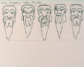
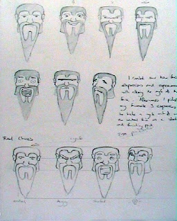
From the work I had done on exaggerating facial features I selected my favourite expressions i had drawn and redrew them in the same face layout. from this I experimented further and created a final character and drew a page full of different facial expression for the character.


This lead on to become my morphing facial expression video of Vaughnie the Viking.

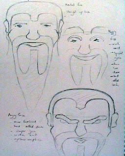
Exaggeration


After looking at the principle of exaggeration these are a few pictures showing some work I did on exaggerating facial expressions, to the point where I was beginning to form a character from them

Storyboard


This is the story board for my man WIP, laying out the basic idea for the animation.

Friday, October 9, 2009

Vaughnie the Viking

The face expression cycle started with an exaggeration exercise (pictures of the sketchbook work will be uploaded soon). I drew various extreme facial expressions before refining them into one character with a different variety of expressions, picked the best ones and made this short animation from that. After something ridiculous like 21 hours work and one serious mistake its finished so i can relax


Friday, October 2, 2009

Man WIP

This is a work in progress of a little side project I'm doing, i wanted
to try something a little bit more complicated and ambitious as a result
I've left it very sketchy and if I'm pleased with it when I've finished i will
neaten him up a bit.


First Animation

This is my first ever piece of animation made from a flipbook, please leave any
feeback it'll be interesting to see who finds the same problems with it as
me

to watch the video on youtube click: